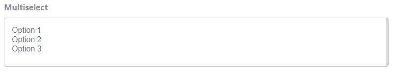
The Multi select element is a form element that lets the user choose multiple options from a list.
Multiselect
Settings
Basic
Label
Sets the label of the element.
Unique Name
The unique element identifier is displayed here, you may need this for advanced usage.
Options
Sets the options that the user can choose form. The submitted value can be different from the option text by enabling the Customize values option and changing the value of each option. Set the default selected options by clicking the check (tick) icon for the option.
Description
Sets description text to display below the field.
Field icon
Choose icons to display on the left or right side of the field.
Validators
Add validators to the element which checks whether the data entered by the user is valid and displays an error message if it’s not valid. Available validators for this element are listed below.
- Required – Sets the field to be required, i.e. the user must complete this field.
Style
Label position
Choose where to display the label relative to the field. “Inherit” means that the label position will be inherited from the global form settings.
Icon position
Choose icons to display on the left or right side of the field. “Inherit” means that the icon position will be inherited from the global form settings.
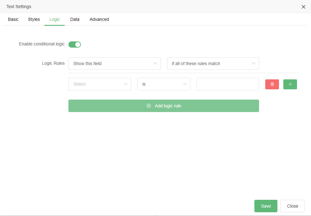
Logic
Enable conditional logic
Enable or disable the conditional logic for this element.
Logic rules
Add a logic rule to this element by clicking Add logic rule, then choose the element, operator and value that will trigger the rule.
Data
Default value
Sets the default value of the element, which is the value that the field has when the form is first displayed.
Dynamic default value
Enable or disable the dynamic default value for this element.This option allows the field value to be set from a URL parameter.
Parameter name
Sets the name of the parameter to use as the source of the dynamic default value.
Maximum length
Sets the maximum allowed length of the submitted value, the user will not be able to enter more than this number of characters into the field.
Read only
Sets the field to be read only, meaning the user cannot change the value of the field.
Show in email
If enabled, the submitted element data will be shown in the default notification email.
Advanced
Unique ID
The unique element identifier is displayed here, you may need this for advanced usage.
Filters
Add filters to the element which strip unwanted characters from the submitted data. Available filters for this element are listed below.
- Alpha – Removes any non-alphabet characters
- Alphanumeric – Removes any non-alphabet characters and non-digits
- Digits – Removes any non-digits
- Regex – Removes characters matching the given regular expression
- Strip Tags – remove any HTML tags
- Trim – Removes white space from the start and end