- Name – This is a field name and not used to display on the form. Only characters from a-Z and 0-9 can be allowed.
- Alias – Texts here will be shown in the form.
- ToolTip-To set tooltip texts for the fields.
Add new fields
Add Field
Control Settings
There are totally 17 types of control included in the module, You can define different control types for each field.
- Control Type -To set types for the fields.
- Width – To set width for the the control, normally set to 100%.
- Required – To set whether it is required.
Item Option
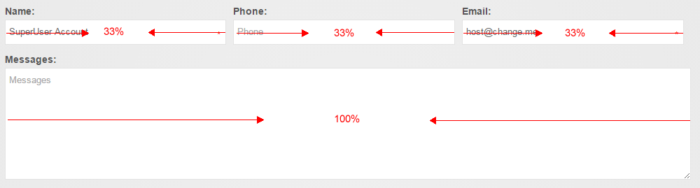
You can set width for each field. You can set width of each of the three fields to 33%, so these three fields will display in one line.
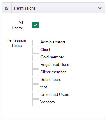
Permissions
You can set view permission for each field.
E-mail Template Options
To set whether the fields will be included in the email templates.
Control Types
This module contains 17 controls, now we will elaborate on the use for these fields.
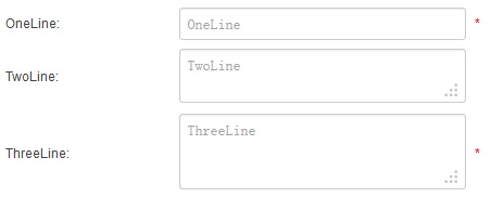
TextBox
This field allows user to enter text in one or multiple lines.
- Width -To set widths for the controls.
- Rows is for the height of input box, for instance, it will show with multiple lines if you set it to 2, then you can
enter multiline text. - Default Value – To set default value in the input box..
- Verification – You can set up different validation for the field, for instance, when you choose Email, it will only allow
to enter correct email address. - Required – To set whether it is required..
- Equals Control – Another field can be set as the equivalent fields. Only when the values of the two fields are the same
can users submit forms. - Max Length – To set the number of characters for the input box..
TextBox ( DisplayName )
This control will show the DisplayName of current user once he/she logs in.
TextBox ( Email )
This control will show the Email of current user once he/she logs in.
You need to use this field to collect emails of submission users, otherwise, submission users will not receive emails.
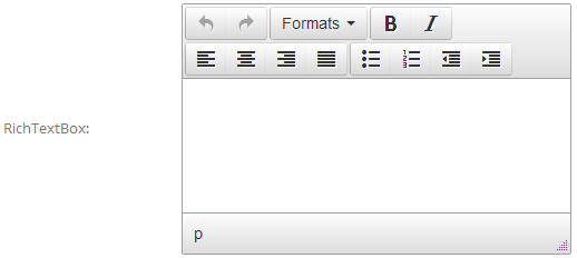
RichTextBox
This control allows you to enter some complicated text.
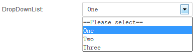
DropDownList
You can enter multiline texts in List Collection, each line text stands for an option.
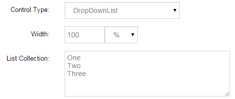
You can enter a default value in Default Value, which must be option included in the List Collection.
Below is the screen shot for control:
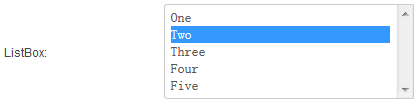
ListBox
You can enter multiline texts in List Collection, each line text stands for an option.
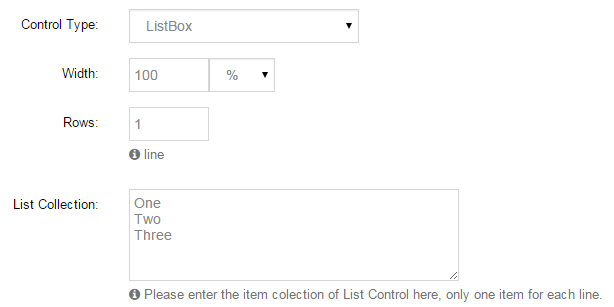
You can enter one or multiple default values in Default Value, multiple values should be separated by comma.
All the default values should be option included in List Collection.
Below is the screen shot for control:
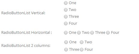
RadioButtonList
- Direction – To set the direction to display.
- Column – You to set number of columns for the control and it is valid only when Horizontal above is selected.
- List Collection – You can enter multiline text in List Collection, each line text stands for an option.
- Default Value – You can enter default values in Default Value. All the default values should be option included in List
Collection.
Below is the screen shot for control:
FileUpload
Users can upload an attachment through this field, and set File extensions through Host > Host Settings > Other Settings > Allowable File Extensions.
You can view the file uploaded by user through History Records.
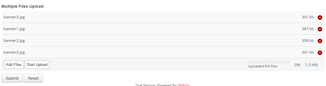
MultipleFilesUpload
Users can upload multiple attachments through this filed.
Below is the screen shot for control:
CheckBox
You need to fill in the prompts for CheckBox in ToolTip.
Below is the screen shot for control:

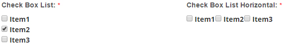
CheckBoxList
- Direction – To set the direction to display.
- Column – You to set number of columns for the control and it is valid only when Horizontal above is selected.
- List Collection – You can enter multiline text in List Collection, each line text stands for an option.
- Default Value – You can enter default values in Default Value. All the default values should be option included in List
Collection.
Below is the screen shot for control:
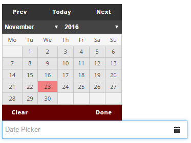
DatePicker
You can select a date easily through this control.
Below is the screen shot for control:
Label
You can enter some texts in Default Value, the texts will display on the form as description.
Below is the screen shot for control:

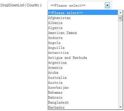
DropDownList ( Country )
This control contains option from all over the countries.
Below is the screen shot for control:
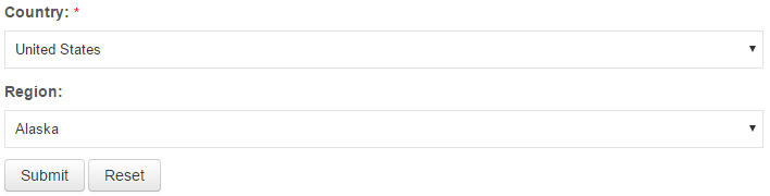
DropDownList ( Region )
To set the states which corresponds to the country, you need to have the country field selected in Associated Control.
Below is the screen shot for control:
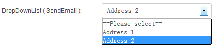
DropDownList ( SendEmail )
You can enter multiline texts in List Collection, the text format must be written as below:
Address 1: [email protected]
Address 2: [email protected]
This field allows user to choose an address to send email.
For instance, if one user chooses Address2, the submitted email will be sent to email bonded with Address 2, which is [email protected] in this case.
Below is the screen shot for control:
HTML
Some texts or HTML codes can be added.
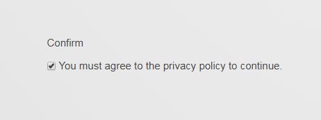
Confirm
This control is a secondary confirmation control. User can tick after submitting
Default Value – You can set whether the default is not checked. Only 2 values can be filled, true and false.
Below is the screen shot for control: