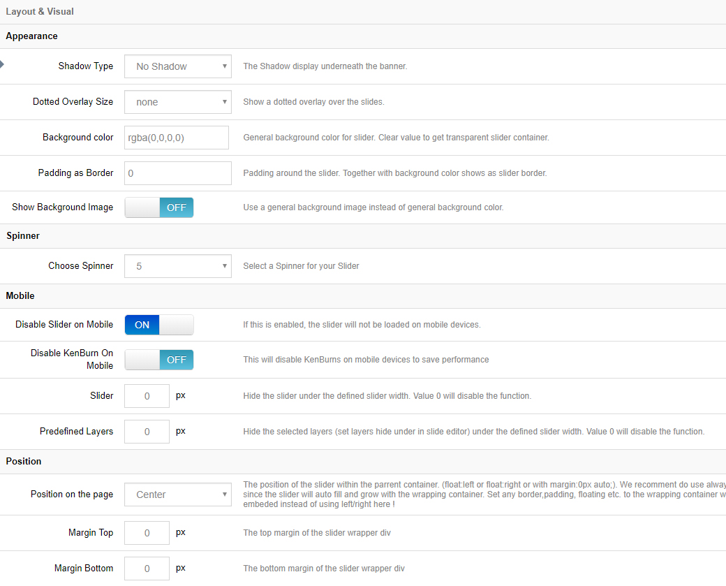
Shadows will be shown beneath the slider. Choose between 6 different styles, or choose “No Shadow” (the default option).
Layout & Visual
Appearance
Shadow Type
Dotted Overlay Size
Dotted overlays are transparent grid-like graphics that will be placed above the slides, giving the slider a “mesh” type look (4 styles available)
Slider Background
The slider’s main background. Normally if your individual slides have their own background images, the slider’s main background would only be visible when the slider first loads, and before the first slide displays. But setting a background here for the slider itself is particularly useful for when you’re using “Transparent” slides (slides with no background image).
Spinner
The spinner will be shown when the slider first loads, and also for additional slides if LazyLoad is being used. Choose between 6 different spinner styles, or choose “Off” for no spinner.
Mobile
Disable Slider on Mobile
Choose to disable the entire slider on mobile devices.
Disable Ken Burn on Mobile
The Ken Burns effect is an advanced animation that looks great on desktop computers, but for mobile devices, providing a more simple slider can sometimes be a better user-experience. Depending on your preference, toggle the KenBurns effect on and off for mobile with this setting.
Hide Element Under Width
Choose to hide the entire slider, individual layers, or all layers when the screen size is below a specific pixel width (i.e. 640px, etc.).
Hiding layers is useful for when lots of content displays nicely on desktop, but there isn’t really enough real estate (screen space) to fit everything on mobile.
Position
Position on the page
The default alignment for the slider. Options are “left”, “center” or “right”.
Position on the page
Add some space above or below the slider in relation to other content on the page. Both positive and negative numbers supported.