Adding Items (All New)
All New adds a new display item. Open it via the All New menu at the top of the management area, or the Add New button in the All Items list. The page title varies by effect — for slideshow effects it reads Add New Slider.
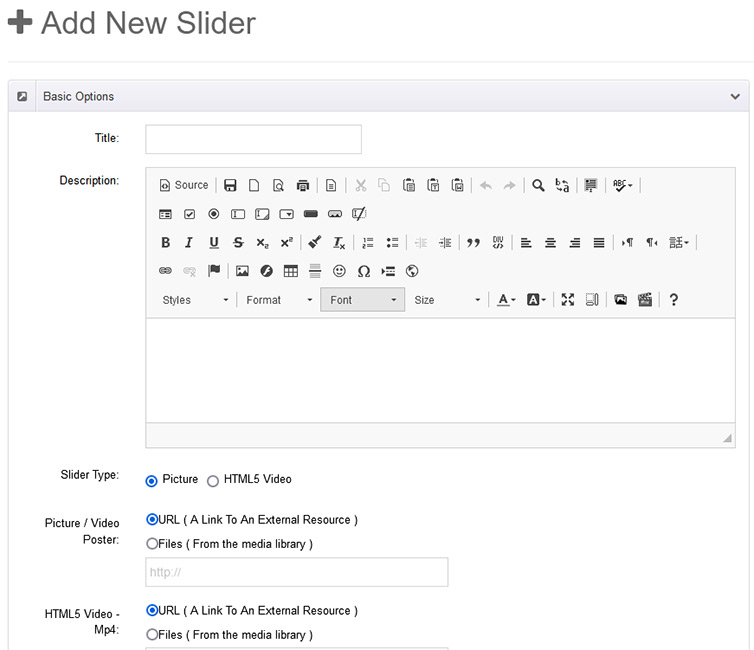
The form has two columns: the left column holds content fields (they vary by effect) and the right column holds publishing options and permissions.
Left Column: Content Fields
Fields differ per effect. Taking a slideshow effect (Effect 01 SlideShow H) as an example, the left column has three panels:
Basic Options
| Field | Description |
|---|---|
| Title | Item title, required |
| Description | Rich text editor with formatting, images and links |
| Slider Type | Picture or HTML5 Video |
| Picture / Video Poster | Slide background image or video poster; source can be a URL or Files (upload/pick from the Media Library) |
| HTML5 Video - Mp4 / Webm / Ogg | Shown when the type is HTML5 Video; provide multiple formats for browser compatibility |
| Thumbnail | Small image for thumbnail navigation; URL or Files |
| Thumbnail Title | Title shown on the thumbnail (falls back to Title if empty) |
Description Options (per-item override)
Check Enable Single Setting to give this single item its own caption styling, overriding the matching effect-level settings:
- Display Title / Display Description: show the title/description;
- Description PositionX / PositionY + Spacing: caption alignment (left/center/right, top/center/bottom) and offsets;
- Description Transitions: caption entrance animation;
- Description Bg / Bg Opacity / Title Color / Description Color: caption background, opacity and colors.
When unchecked, the shared settings from the Effect Options apply.
Picture Link
| Field | Description |
|---|---|
| Picture Link | URL opened when the slide is clicked; type a URL or pick a site page |
| Target | Open in _self (same window), _blank / new (new window), _parent or _top |
| Image Alt | Alternative text, good for SEO and accessibility |
TIP
Other effects have similar panels (e.g. Isotope adds a group field, Timeline adds a date field). The actual form always matches the current effect — see the effect pages for each effect's data fields.
Right Column: Publishing Options
Publish
| Setting | Description |
|---|---|
| Status | Activated (shown), Hidden (not shown) or Recycle bin |
| Start | Immediately, or a scheduled date/time to go live |
| Disable | None (never), or a date/time when the item expires |
Click [Edit] to expand, then OK to confirm or Cancel to discard.
Scheduled publishing
After setting Start / Disable, also check Filter Start Time / Filter End Time in the module's Data Filter settings for the schedule to take effect on the front end.
Permissions
Controls which users can see this item on the front end:
- All Users: visible to everyone, including anonymous visitors;
- Permission Roles: visible only to the selected roles (e.g. Registered Users, Subscribers).
With no permission granted the item is hidden from the front end — useful for drafts.
Saving
Three buttons sit at the bottom of the form:
| Button | Description |
|---|---|
| Save Draft | Save as draft and continue later |
| Publish | Save and publish the item |
| Cancel | Discard changes and return to the list |
Next Steps
- All Items — manage the entered items
- Media Library — manage image resources centrally
- Effect Overview — see the data fields of each effect