
Content Layouts
This theme includes all the content layouts used on the demo site. You can edit them, and also create your own layouts.
Settings not showing up?
Because of browser caching, your changes may not show up immediately after saving. Press Ctrl+F5 to force a refresh.
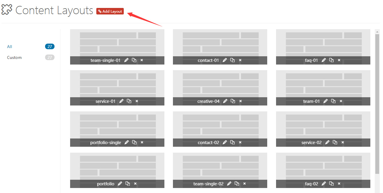
Control Panel Area
Click Add Layout to open the control panel area of Content Layout. Some default layouts are included — you can change and delete them, but don't forget to save at the end.
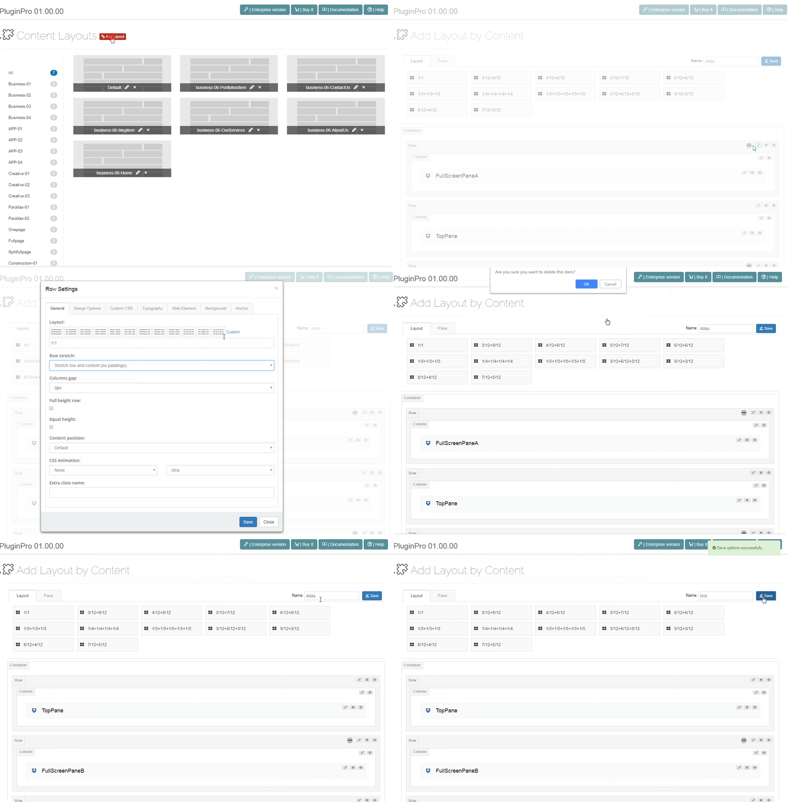
Layout
Choose the layouts you want and drag them to the Container area.
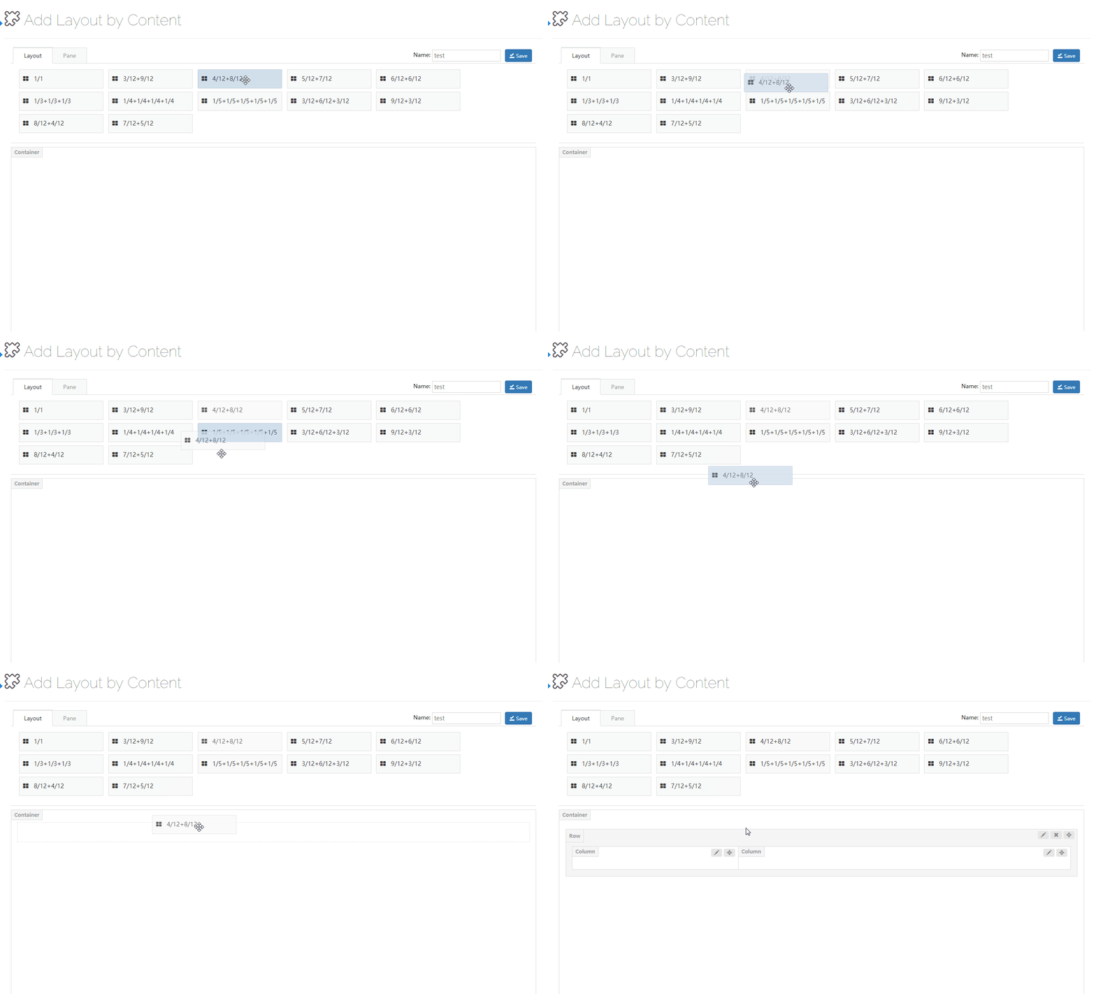
Pane
A pane is the container that lets a page apply modules. You can drag panes to columns.
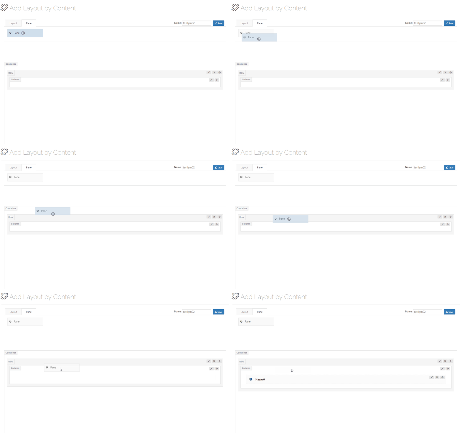
Pane Settings
| Option | Description |
|---|---|
| Pane Name | Set the name of the pane |
| Background Settings | Set a background image and background color for the pane |
| Custom CSS | Add the pre-built CSS of the theme to the pane |
Row Settings
Click the edit button on the right of the row to go to the row settings interface.
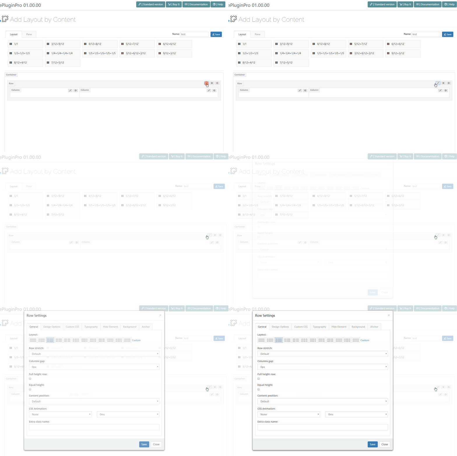
General
| Option | Description |
|---|---|
| Layout | Quickly set the column layout by clicking the corresponding icons, or customize the layout. In custom layouts, you can enter 1/12, 2/12, 3/12, 4/12, 5/12, 6/12, 7/12, 8/12, 9/12, 10/12, 11/12, 12/12, 1/5, 2/5, 3/5, 4/5 and 5/5 |
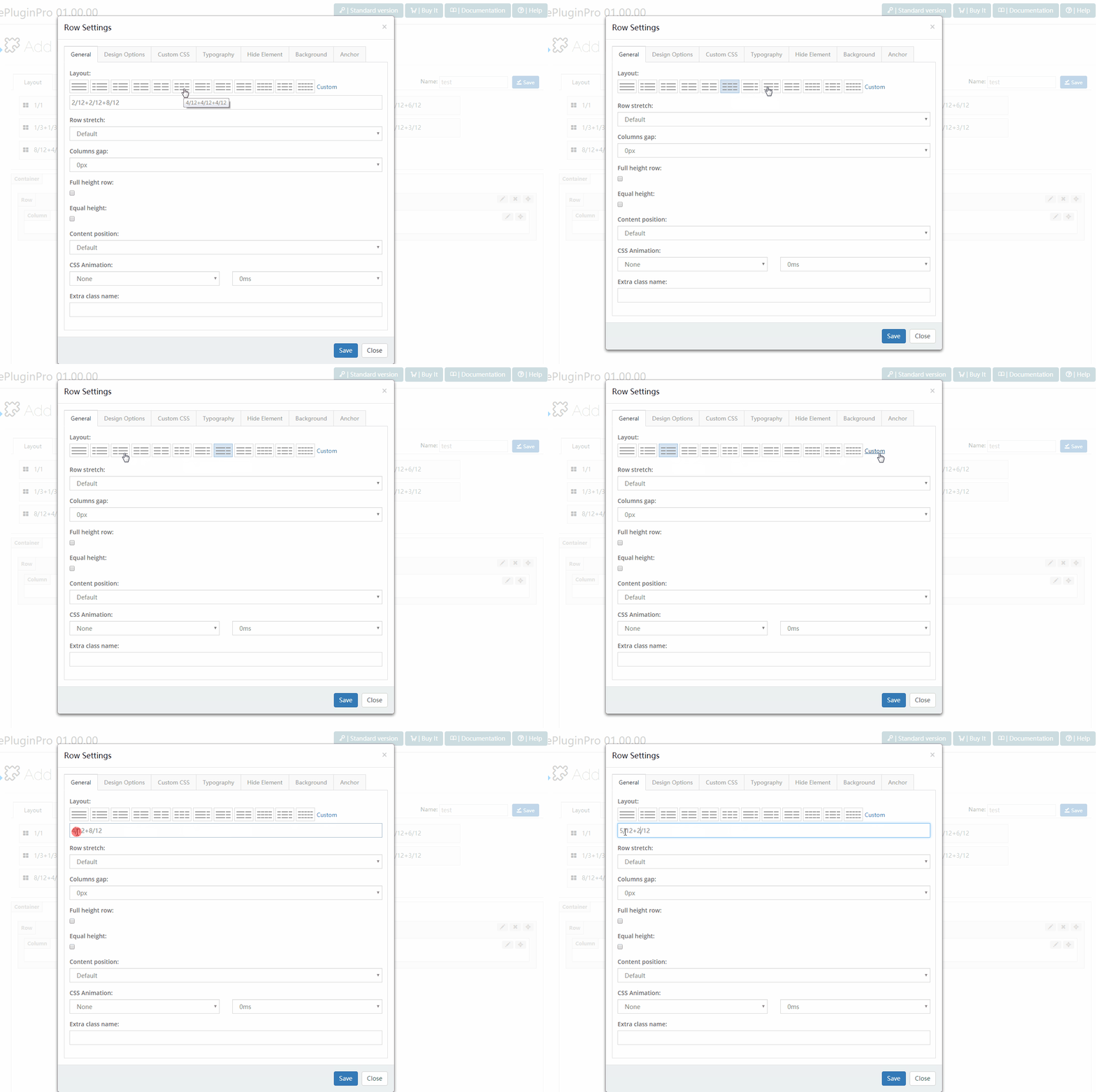
| Row stretch | The width style of the row — 4 styles included, see the table below |
| Full height row | Set the height of the row to be the same as the height of the browser window |
| Equal height | Set every column of the row to have the same height |
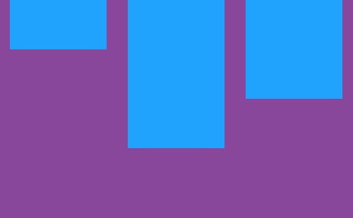
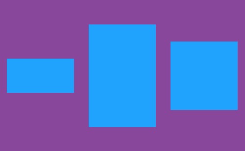
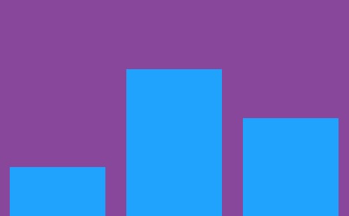
| Content position | Use flexbox alignment utilities to vertically align columns: top / middle / bottom |
| Justify Content | Use flexbox alignment utilities to horizontally align columns |
| CSS Animation | Add an entering animation for elements — choose the animation style and duration |
| Extra class name | Add extra CSS to the row |
The 4 Row stretch styles:
| Style | Description |
|---|---|
| Default | Set the width of the content to be the same as the width of the theme |
| Stretch row | Set the width of the row to full width; the content width is the same as the theme width |
| Stretch row and content | Set the row and the content to full width, with extra spacing on both sides of the content |
| Stretch row and content (no paddings) | Set the width of the row and the content to full width, without paddings |
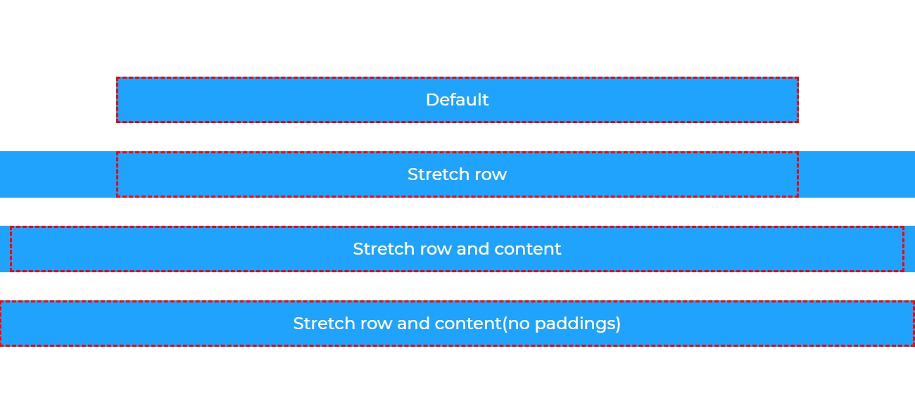
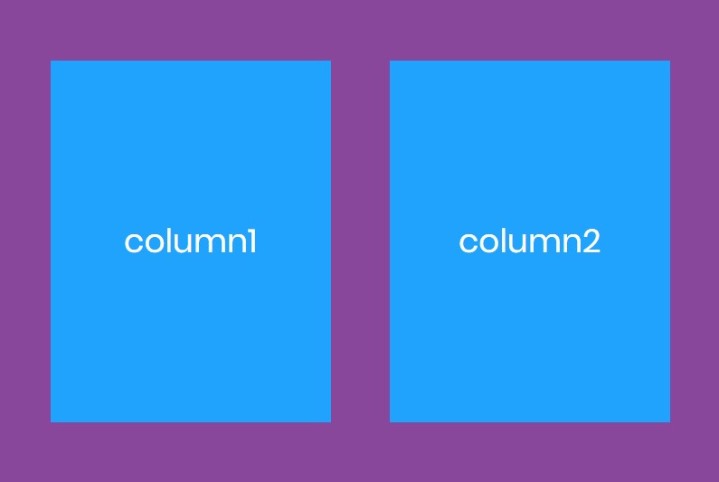
Content position effects:
top:
middle:
bottom:
Custom CSS
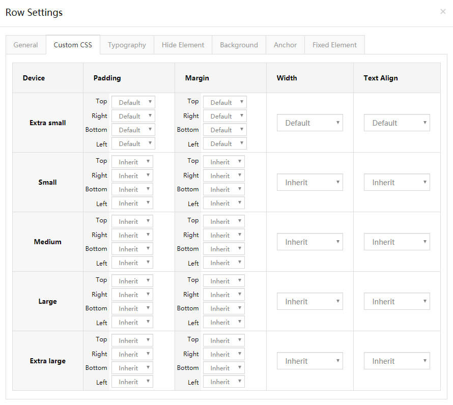
You can add the pre-built CSS of the theme to the row.
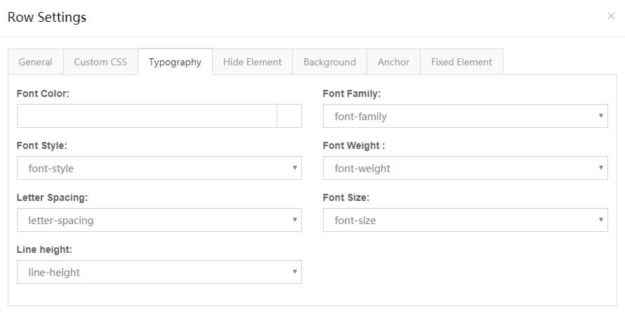
Typography
You can set the text style of the row, for example text size, color, font family and more.
Hide Element
You can set rows to be hidden under some resolutions.
Background
| Background style | Description |
|---|---|
| Single Color | Set the background to a single color |
| Gradient Color | Set the background to a gradient color. Configure the gradient direction (Gradient Type), the start color (Gradient Start Color) and the end color (Gradient End Color) |
| Image | Set the background to an image |
| Parallax | Set a parallax background image |
| YouTube Video | Use a YouTube video as the background |
Parallax settings:
| Option | Description |
|---|---|
| Parallax Style | 2 styles included: Fixed at its position and Parallax on scroll |
| Parallax Factor | With Parallax on scroll, set the displacement range of the background image — also per resolution |
YouTube Video background settings:
| Option | Description |
|---|---|
| YouTube ID | Enter the video ID. To get your YouTube ID, visit the video on YouTube.com and view the URL in the browser's address bar — the ID is after the "v=" part. In https://www.youtube.com/watch?v=AkcUoA2f-jU, the ID is AkcUoA2f-jU |
| Placeholder Images | Set the cover image of the video |
| Loop | Play the video in a loop |
| Muted | Set whether to mute the video |
| Start Time(s) | Set the start time of the video |
| End Time(s) | Set the end time of the video |
| Play video only when in viewport | Play the video only when you scroll down to the video area |
| Display Color Overlay | Add a shade layer to the background — set the color and transparency of the shade layer |
| Enable slanted background | Set whether to slant the background, and set the angle of the tilt |
Anchor
| Option | Description |
|---|---|
| Anchor ID | The anchor ID |
| Anchor Title | The title text |
Fixed Element
Allows setting extra elements for a row, with optional rotating animations. See How to set fixed elements.
Column Settings
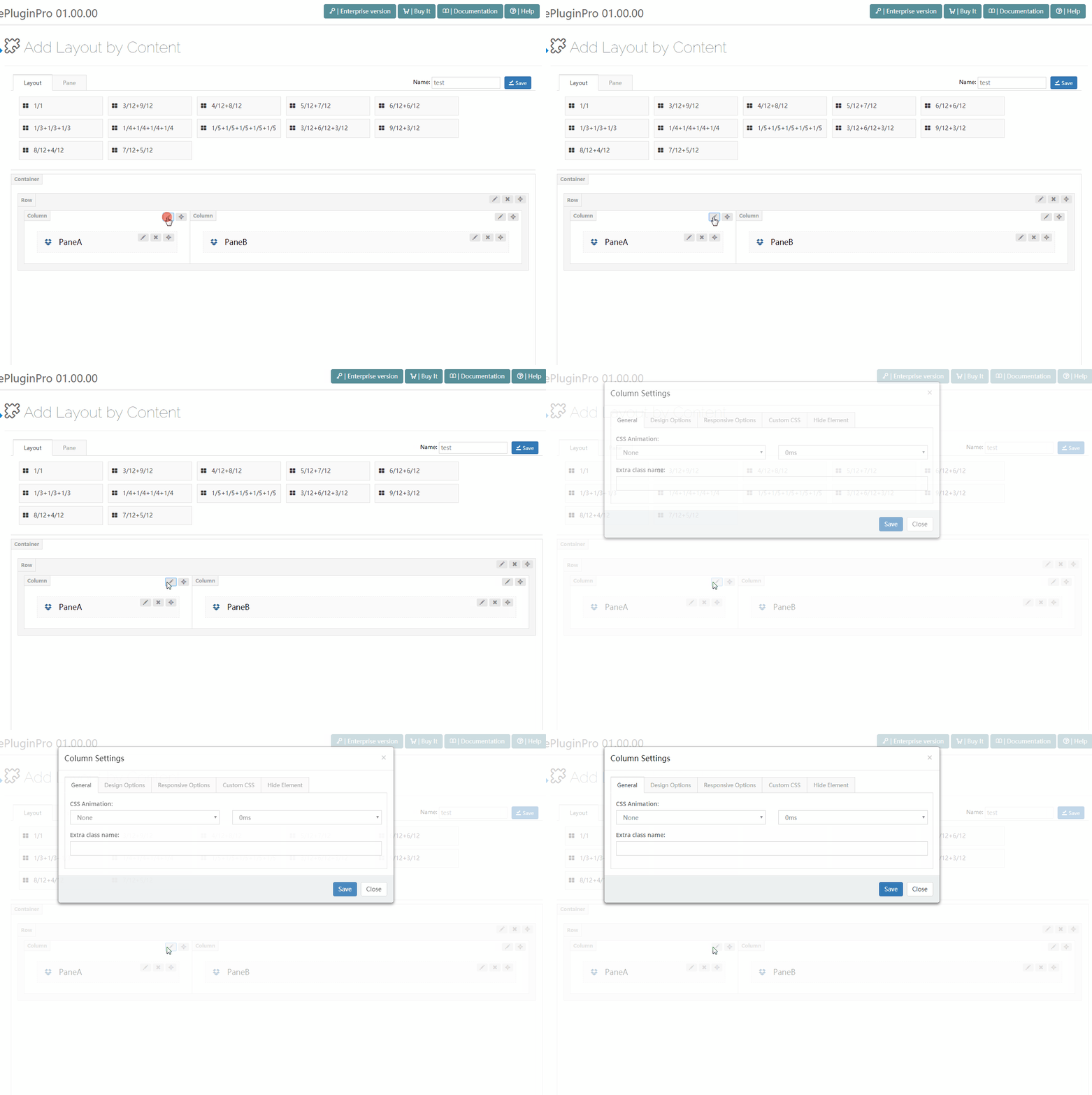
Click the edit button on the right of the column to go to the column settings interface.
General
| Option | Description |
|---|---|
| CSS Animation | Add an entering animation to elements — choose the animation style and duration |
| Content position | Use flexbox alignment utilities to vertically align columns |
| Extra class name | Add extra CSS to the column |
Background Settings
You can set a background image and background color for columns.
Responsive Options
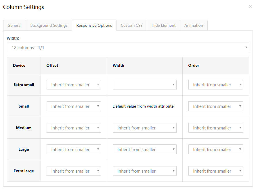
You can set columns per resolution.
| Option | Description |
|---|---|
| Default Width | Set the width of the column |
| Device | Breakpoints: Extra small < 576px, Small ≥ 576px, Medium ≥ 768px, Large ≥ 992px, Extra large ≥ 1200px |
| Offset | Set the offset of the column |
| Device Width | Set the width of the column under different resolutions. The default width on mobile is full width |
| Order | Set the display order |
Custom CSS
You can add the pre-built CSS of the theme to the column.
Hide Element
You can set columns to be hidden under certain resolutions.