
Header Layouts
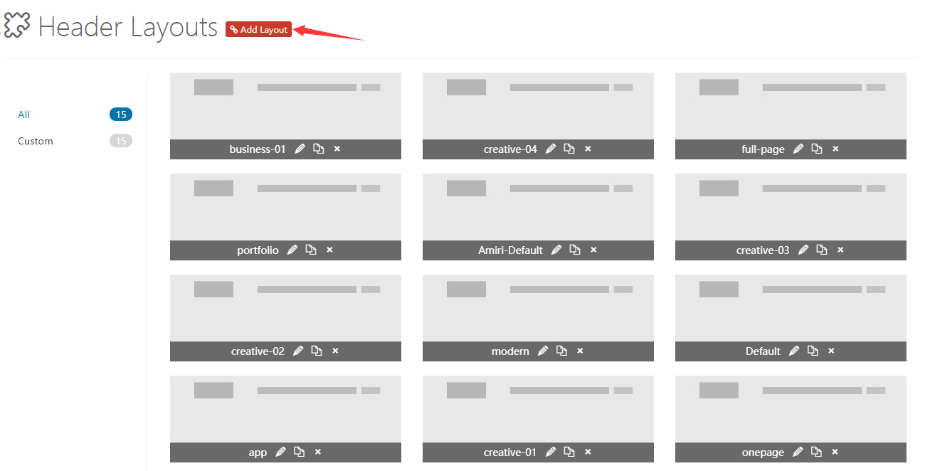
This theme includes all the header layouts used on the demo site. You can edit them, and also create your own layouts.
Settings not showing up?
Because of browser caching, your changes may not show up immediately after saving. Press Ctrl+F5 to force a refresh.
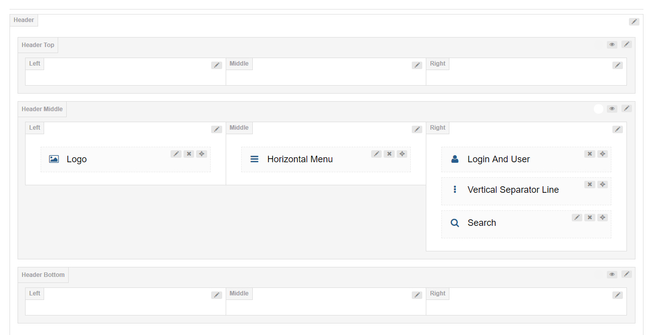
9 Grids Area
We divide the header into 3 rows, and every row has 3 columns. You can add controls to every row.
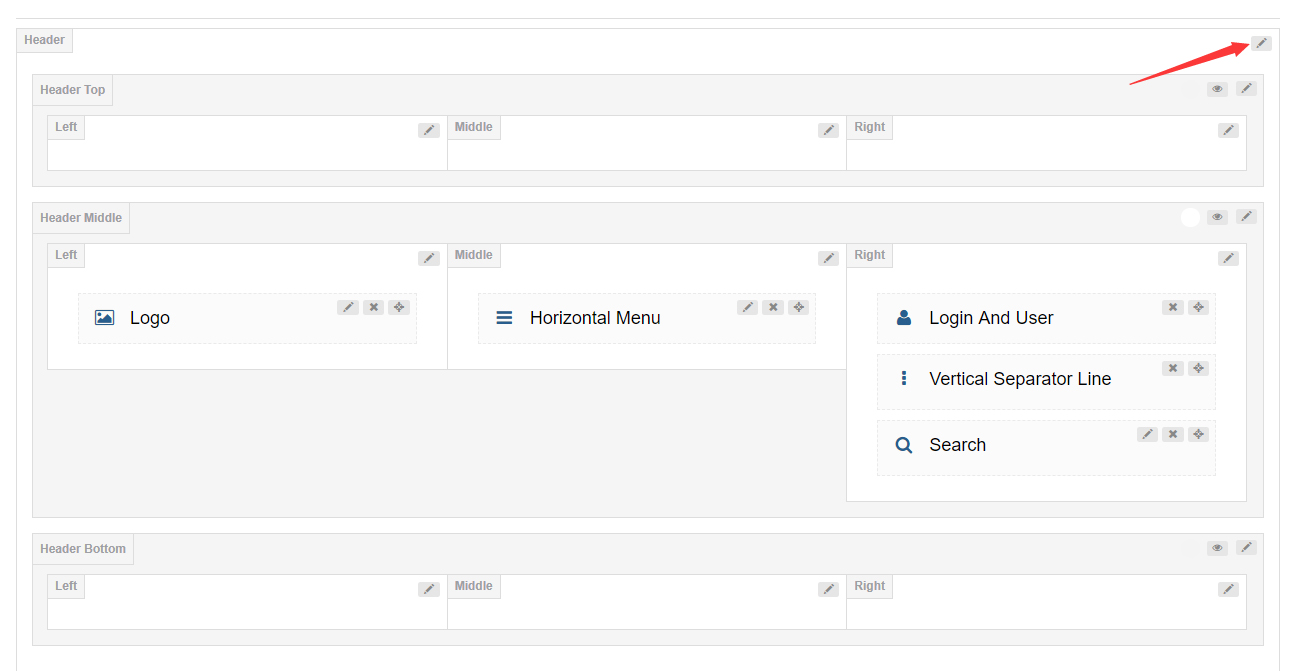
Header Settings
Click the edit icon to open the header settings interface.
| Option | Description |
|---|---|
| Header Position | Set whether to float the header above the banner or page title |
| Sticky Header | When you scroll down the page, the header remains fixed at the top of the page |
| Sticky Header Type | Set the display style of the Sticky Header |
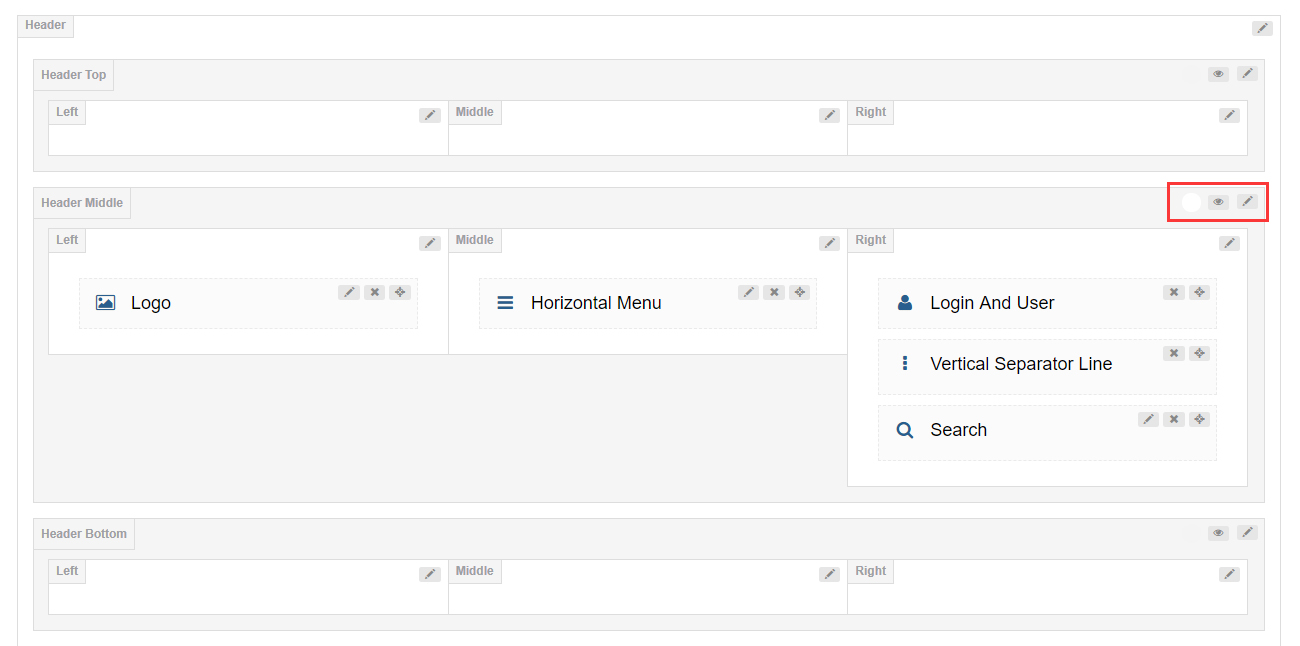
Header (Top / Middle / Bottom) Settings
By default, Header Top and Header Bottom are hidden. Click the eye icon to enable these 2 areas — you can also click the edit button to set them.
General
| Option | Description |
|---|---|
| Row Height (px) | Set the height of the header area |
| Layout | Set the width of the header content area: full width or fixed width |
| Area Space (px) | Set the spacing between the left, middle and right columns |
| Distance Between Controls (px) | Set the distance between the controls of a column area |
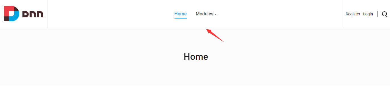
| Split Line Between Grids | Set whether to display the split line between every grid |
| Bottom Line | Set whether to display the split line at the bottom of every area |
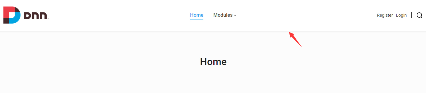
| Display Shadow | Set whether to display the gray shadow at the bottom of every area |
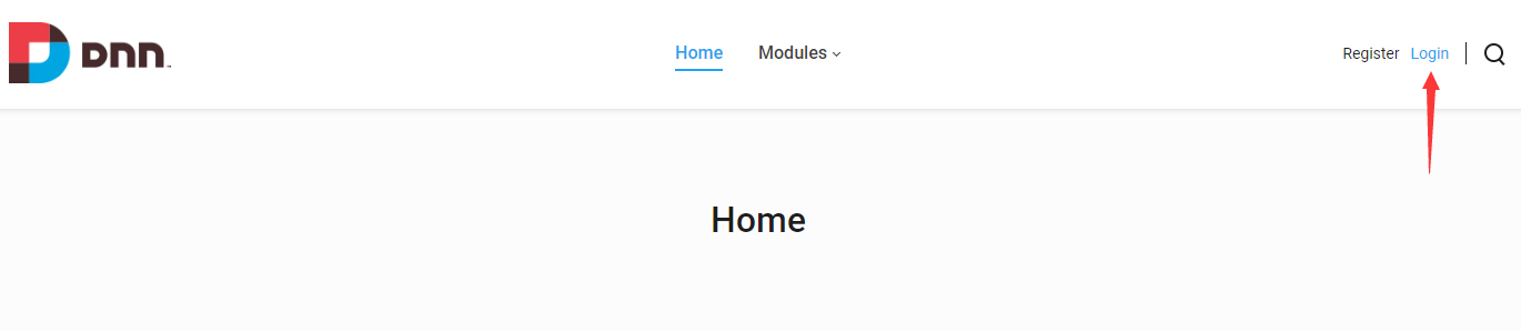
| Accent Color | Set the accent color of every area — generally the color when you hover or click the controls |
| Extra class name | Add extra CSS to every area |

Design Options
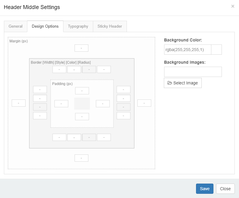
You can set the padding, margin, border, background color and background image for the header area.
Typography
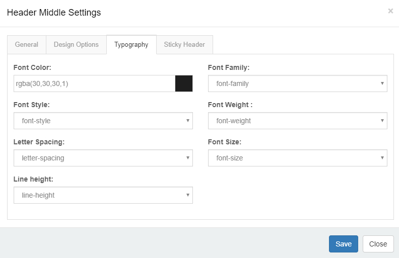
You can set the text style of the header area, such as text size, color, font family and more.
Sticky Header
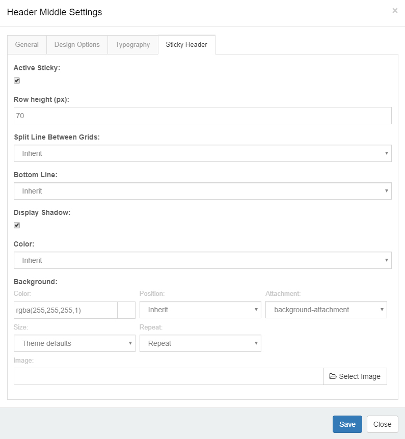
You can set whether to display the header area in the Sticky Header individually, as well as the style of the Sticky Header.
Header Column Settings
General
| Option | Description |
|---|---|
| Column width | Set the width of the column |
| Arrangement | Set the arrangement of the controls: vertical or horizontal |
| Text Align | Set how to align text |
Design Options
You can set the padding, margin, border, background color and background image for columns.
Mobile Header Settings
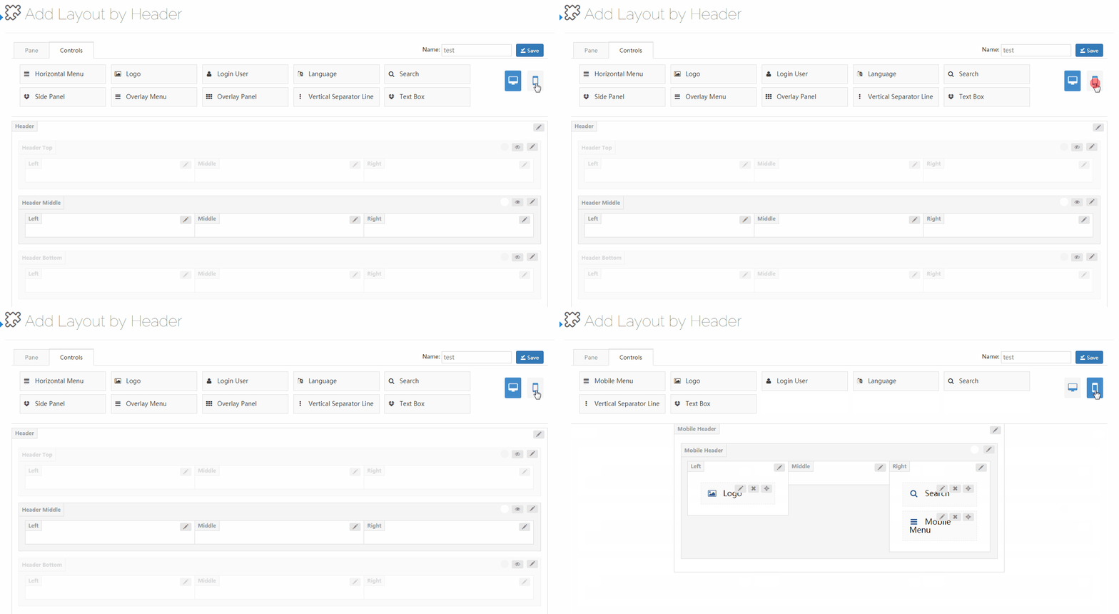
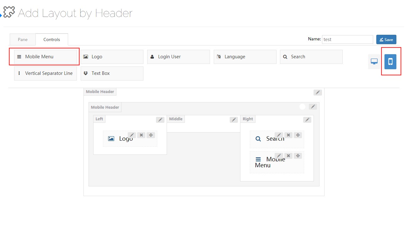
Click the mobile icon to switch to the settings interface of the mobile header layout. The mobile header is divided into left, middle and right areas. You can add controls and panes to the areas separately.
Controls
The controls are some modules we customized — you can drag them wherever you want.
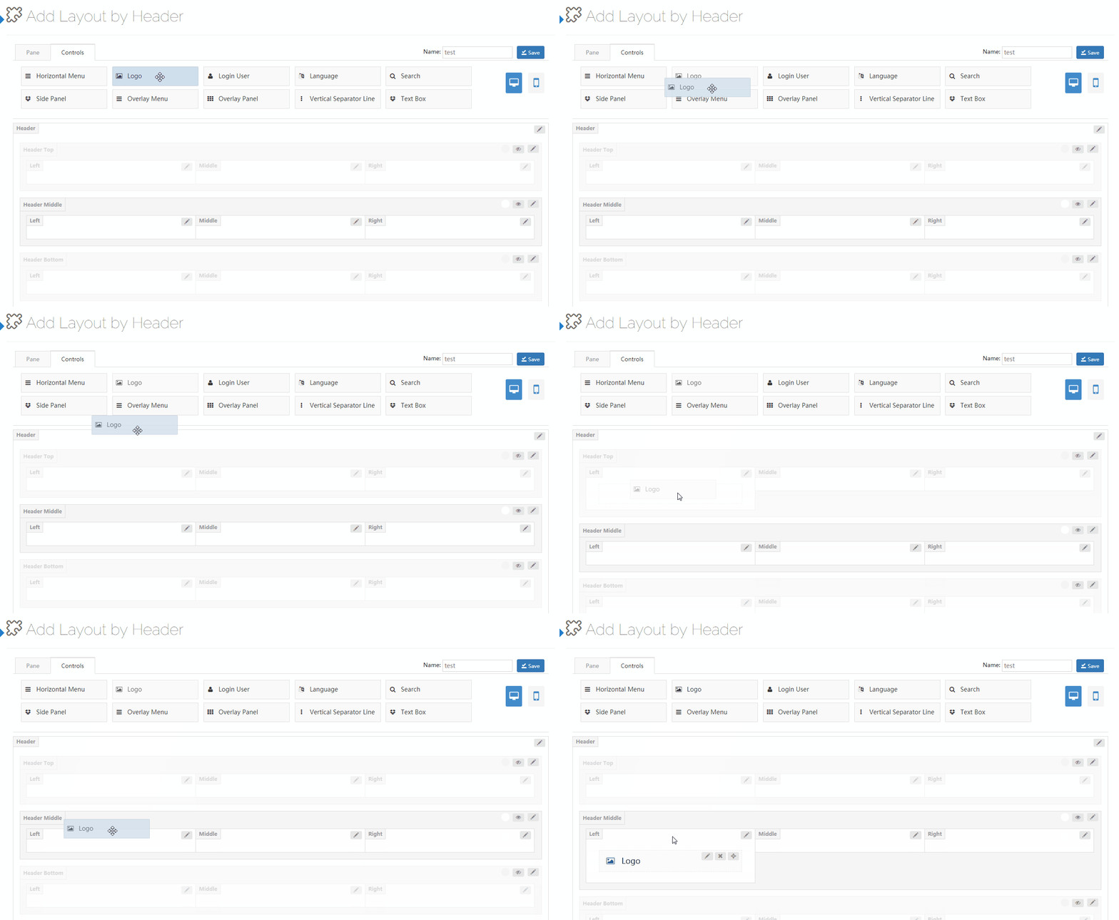
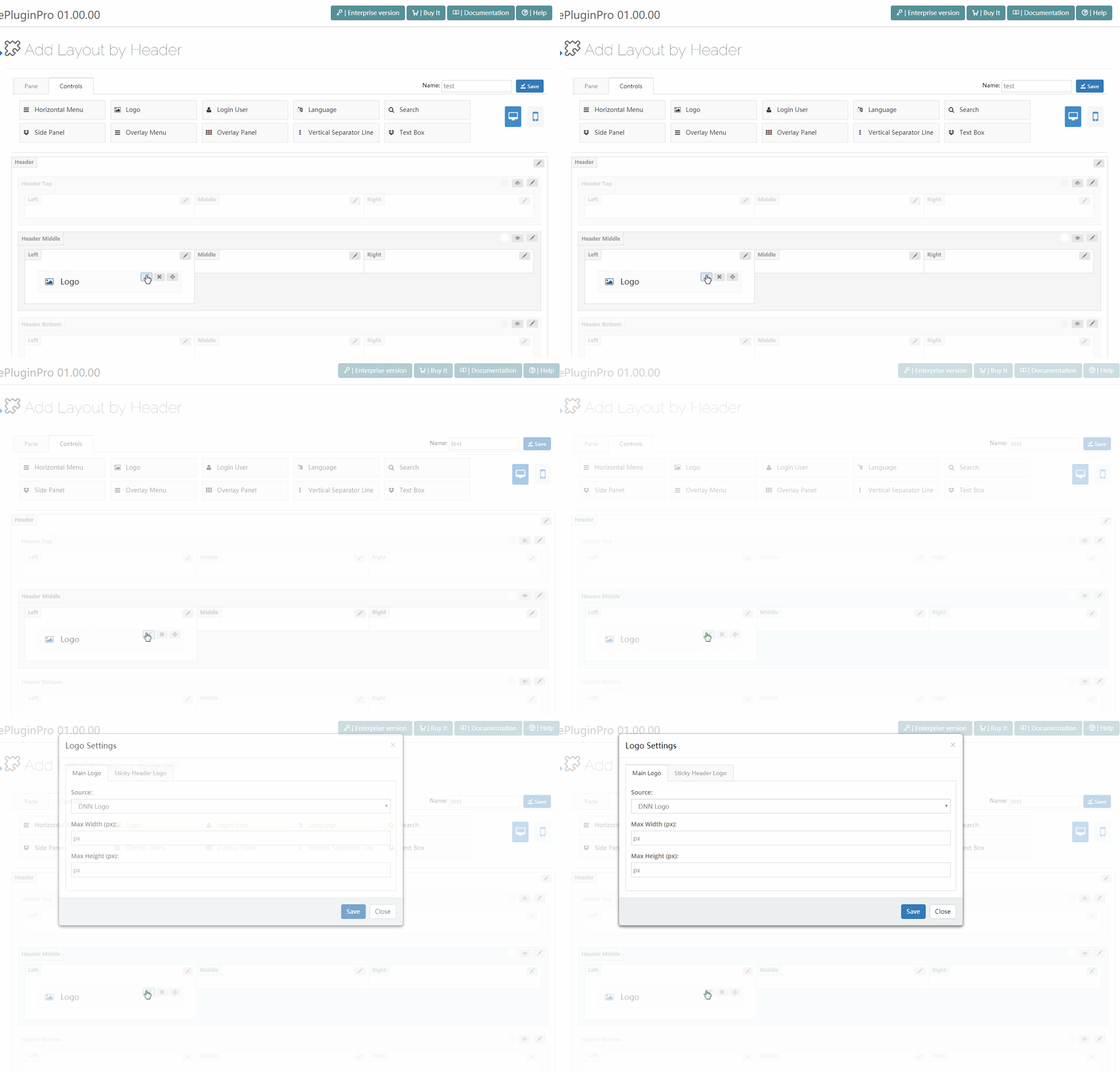
Click the edit button beside a control to go to its settings interface.
Logo
Use the Logo control to display the logo image in the header.

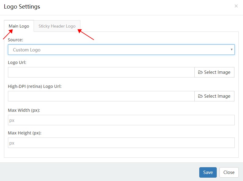
There are 2 areas included in the settings interface of the logo: the settings for the main logo and the settings for the Sticky Header logo.
Main Logo
| Option | Description |
|---|---|
| Source | Set the source of the logo image: the DNN site logo or a custom logo. The DNN site logo needs to be set in admin > Site Settings |
| Logo URL | Set the custom logo image |
| High-DPI (retina) Logo URL | Set the logo image on HD screens. There has to be a -2x suffix at the end of the image name, such as logo-d-2x.png |
| Max Width | The maximum width of the logo |
| Max Height | The maximum height of the logo |
Sticky Header Logo
| Option | Description |
|---|---|
| Source | Set the source of the logo image |
Horizontal Menu
With the Horizontal Menu control, you can display the menu in the header.

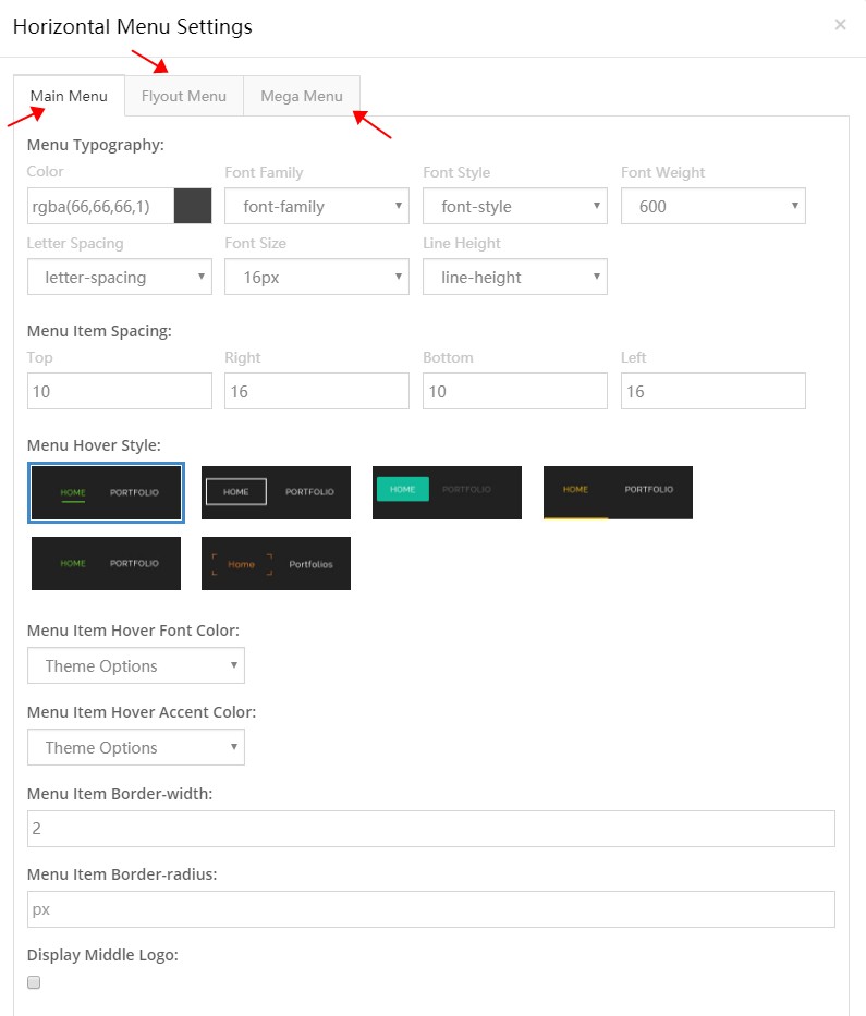
There are 3 areas included in the settings interface of the Horizontal Menu: the settings of the main menu, the settings of the flyout menu, and the settings of the Mega Menu.
Main Menu
| Option | Description |
|---|---|
| Menu Typography | Set the text style of the 1st-level menus, such as text size, color, font family and more |
| Menu Item Spacing | Set the spacing between items at top, bottom, left and right |
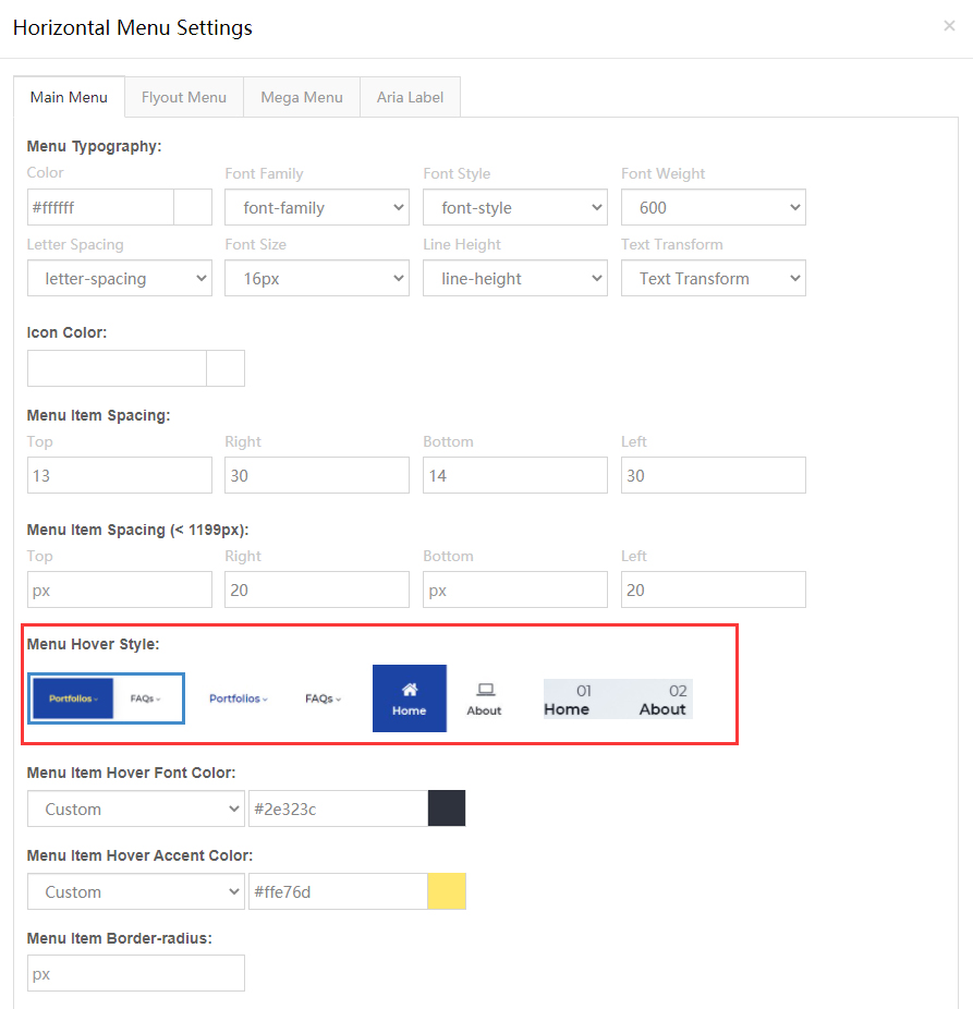
| Menu Hover Style | Set the appearance style of the menu when hovering — 4 styles to choose from |
| Menu Item Hover Font Color | Set the text color of the menu when hovering |
| Menu Item Hover Accent Color | Set the accent color of the menu when hovering |
| Menu Item Border-radius | Set the border radius of the menu items |
| Display Middle Logo | Set whether to display the logo in the middle of the menus |


Flyout Menu
| Option | Description |
|---|---|
| Menu Typography | Set the text style of the pop-up menu |
| Display Shadow | Set whether to display shadow |
| Background | Set the background of sub menus |


Mega Menu
| Option | Description |
|---|---|
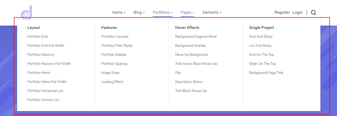
| Menu Typography | Set the text style of the Mega Menu |
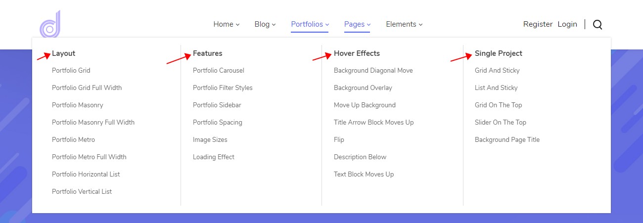
| Menu Title Typography | Set the text style of the title |
| Display Shadow | Set whether to display shadow |
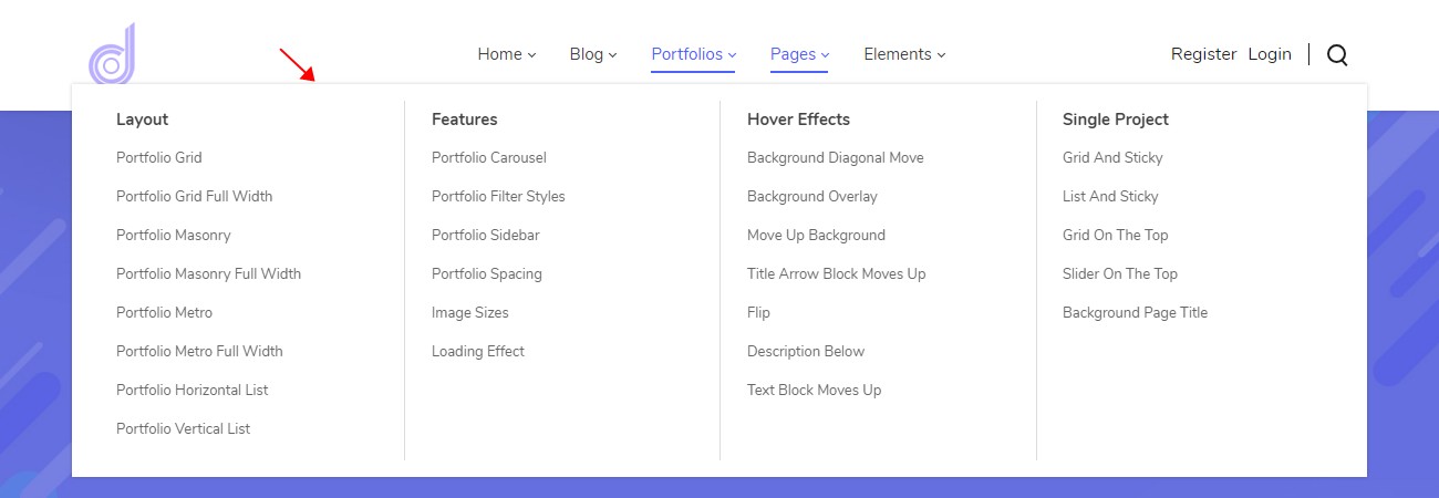
| Line Color | Set the color of the vertical split line |
TIP
The content of a Mega Menu is configured in ThemePluginPro > Pages. See Mega Menu.
Login User
With the Login User control, you can display the login and register links in the header.

The text color of the Login User can be set in Header Settings > Typography.
Language
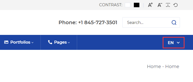
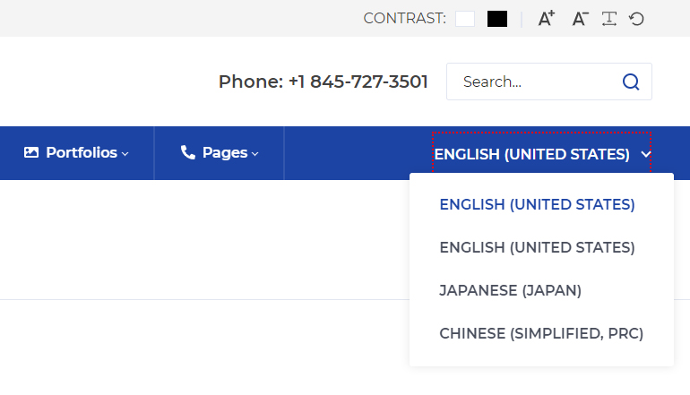
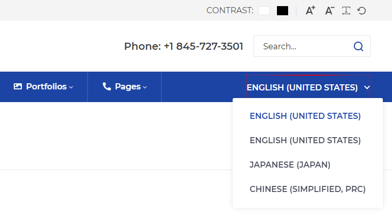
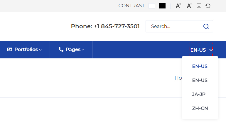
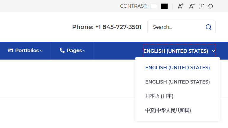
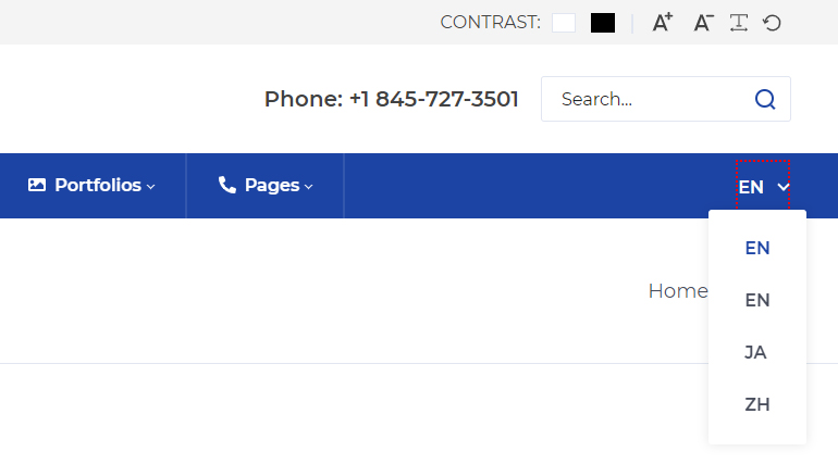
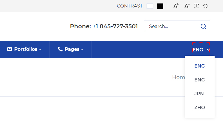
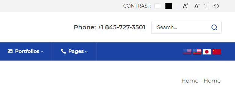
With the Language control, you can display the language selector in the header. There are 7 display types:
| Type | Description |
|---|---|
| Display Name | Display name |
| English Name | English name |
| Name | Name |
| Native Name | Native name |
| Two Letter | Two-letter code |
| Three Letter | Three-letter code |
| Flags | Flags |
Search
With the Search control, you can display the search input box in the header.
| Option | Description |
|---|---|
| Placeholder | The default text of the search box |
| Style | Set the style of the search panel |
| Accent Color | Accent color |
Vertical Separator Line
With the Vertical Separator Line control, you can display the vertical split line in the header.

The color of the Vertical Separator Line control can be set in Header Settings > Typography.
Text Box
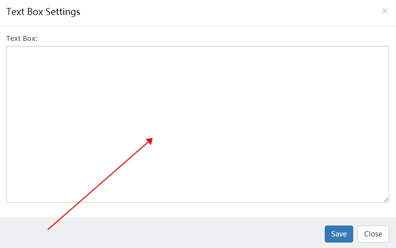
With the Text Box control, you can input text or HTML code.

Mobile Menu
The Mobile Menu control belongs to the controls of the mobile header.
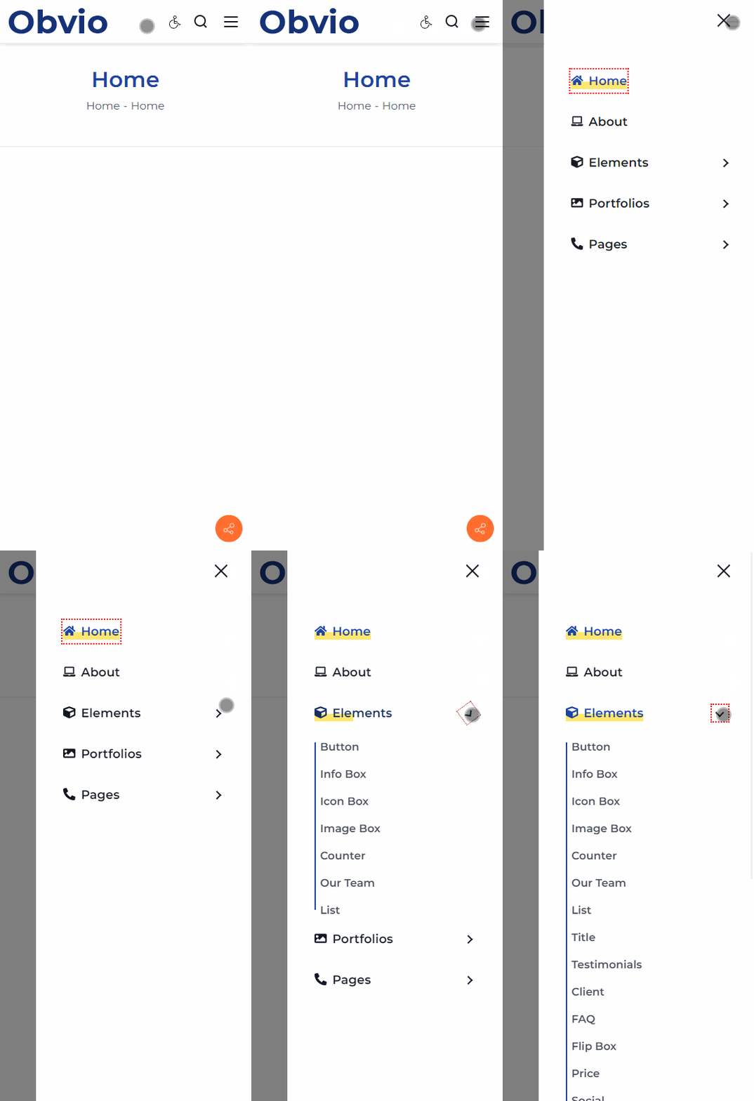
Clicking the nav icon of the mobile menu pops up the menu.
| Option | Description |
|---|---|
| Level 1 Menu Typography | Set the text style of the level 1 menu |
| Level 2 Menu Typography | Set the text style of the level 2 menu |
| Level 3 Menu Typography | Set the text style of the level 3 menu |
| Current Color | Set the text color of the current menu item |