
Theme Options
In this settings page, you can do global settings for the appearance of the entire site.
Settings not showing up?
Because of browser caching, your changes may not show up immediately after saving. Press Ctrl+F5 to force a refresh.
Layout
Layout Setting
| Option | Description |
|---|---|
| Header Layout | Set the header layout of your site. You can also create it in ThemePluginPro > Layout > Header Layout |
| Content Layouts | Set the content layout of your site. You can also create it in ThemePluginPro > Layout > Content Layout |
| Footer Layout | Set the footer layout of your site. You can also create it in ThemePluginPro > Layout > Footer Layout |
Container Setting
| Option | Description |
|---|---|
| Container Layout | Set the display mode of the theme, Boxed or Wide |
| Content Margin | Set the spacing around the content area |
| Container Width | Set the width of the content area. You can also set a responsive width for different resolutions |
Design
Body Background
Set the background color or background image for the theme.
Content Style
Set the text color, size and more of the content area.
H1 - H6 Style
Set the text color, size and more of heading 1 – heading 6.
Button Color
Set the button color.
Loading Style
The loading animation will be displayed when loading a page.
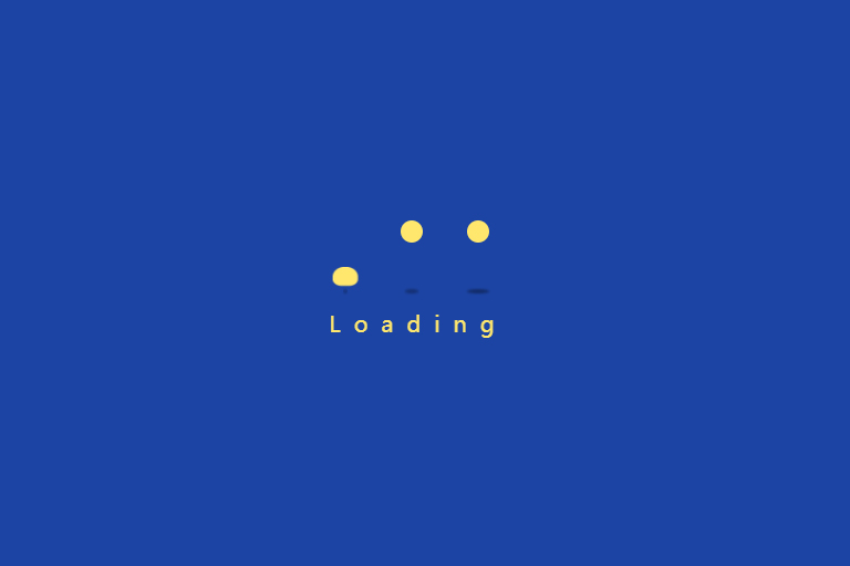
| Option | Description |
|---|---|
| Enabled | Enable the loading animation |
| Background Color | Set the background color of the loading animation |
| Color | Set the color of the circles |
| Loading Text | Set the loading text |
Fixed Widget
The Fixed Widget will be displayed at the bottom right of the page.
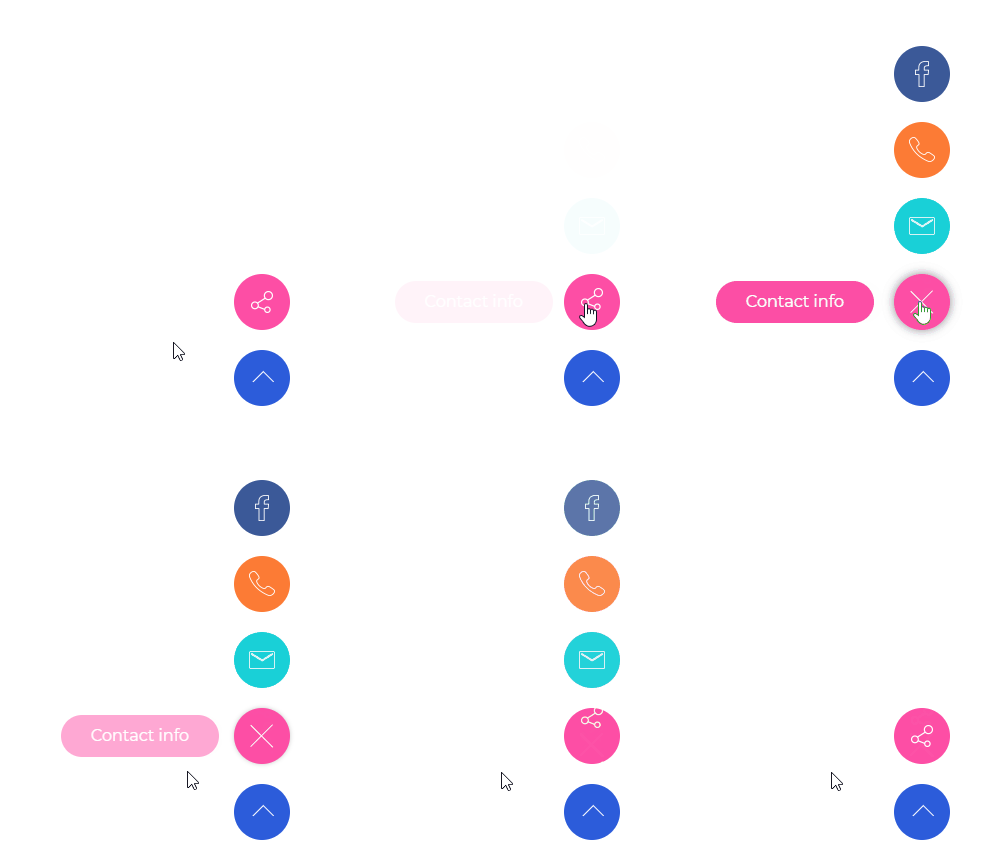
| Option | Description |
|---|---|
| Enabled Fixed Widget | Set whether to display the widget |
| Social Media icon | Set the text and link of the social media |
| BackTop | Set whether to display the back-to-top icon |
| BackTop Text | Set the text shown when hovering the back-to-top icon |
Page Title
| Option | Description |
|---|---|
| Page Title Enabled | Set whether to enable the page title |
| Page Title Layout | Set whether to display the page title area |
Vertical Layout — title and breadcrumb are displayed in 2 separated rows.

Horizontal Layout — title and description are displayed in the same row.

| Option | Description |
|---|---|
| Height | Set the height of the page title area |
| Display Arrow | Set whether to display the downwards arrow. The page will scroll down to the content area when the arrow is clicked |
| Display Breadcrumbs | Set whether to display breadcrumbs |
| Scrolling Text Animation | When scrolling down the page, set whether to display scrolling animation for text |
| Background Color | Set the background color of the page title area |
| Background Image | Set the background image of the page title area |
| Color Overlay | Set whether to display the background shade layer. The shade layer will be displayed over the page title. You can also set the background color and its transparency |
| Font Color | Set the text color of the page title area |
| Font Size | Set the text size of the page title area |
| Background Region | Set the display range of the background, whether to include the header area |

Breadcrumbs
| Option | Description |
|---|---|
| Display Breadcrumbs | Set whether to display the breadcrumb area |
| Location | Set the location of the breadcrumb, inside the page title or outside the page title |
| Text Align | Set how to align the breadcrumb: left, center or right |
| Layout | Set the width of the breadcrumb area |
| Background Color | Set the background color of the breadcrumb area |
| Spacing | Set the spacing around the breadcrumb text |
| Display Border Line | Set whether to display the line at the bottom of the breadcrumb area |
| Breadcrumbs Style | Set the style of the breadcrumbs — 3 styles available |
| Breadcrumbs Accent Color | Set the accent color of the breadcrumb |
| Breadcrumbs Color | Set the text color of the breadcrumb |
| Breadcrumbs Font Size | Set the text size of the breadcrumb |
| Breadcrumbs Line Height | Set the line height of the breadcrumb text |

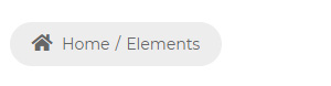
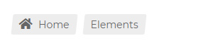
Sidebar
| Option | Description |
|---|---|
| Enabled | Set whether to enable the sidebar |
| Sidebar Position | Set the position of the sidebar, on the left of the page or on the right |
| Sidebar Width | The theme uses the Bootstrap framework and the content section is divided into 12 columns. Set how many columns the sidebar takes |
| Fixed Sidebar | Set whether to enable the fixed function of the sidebar. When content scrolls, the sidebar stays fixed |
| Sidebar Spacing | Set the distance around the sidebar |
Sidebar Menu
| Option | Description |
|---|---|
| Display Sidebar Menu | Set whether to enable the sidebar menu |
| Menu level | Set the display level of the menu. ALL displays menus of all levels; 1 displays menus under the 1st level (1st level menus themselves are not included); 2 displays menus under the 2nd level (2nd level menus themselves are not included) |
| Menu Color | Set the text color of the menu |
| Menu Font Family / Weight / Size / Line Height | Font family, weight, size and line height of the main menu text |
| Sub Menu Font Family / Weight / Size / Line Height | Font family, weight, size and line height of the sub menu text |
Footer
| Option | Description |
|---|---|
| Footer Mode | Choose the display mode of the footer. Scroll means the footer scrolls with the page; Fixed means the footer stays fixed at the bottom of the page |
Plugins
This theme has integrated many jQuery plugins and CSS plugins. You can set to enable or disable the plugins. Disabling some plugins that are not used on your site can speed up access.
| Option | Description |
|---|---|
| jQuery Library | Set whether to enable the jQuery plugins |
| CSS Library | Set whether to enable the CSS plugins |
Accessibility
This theme includes the aria-label attribute. In some situations, aria-label provides an accessible name when there is no visible label due to a chosen design approach or layout, but the context and visual appearance of the control make its purpose clear.
For example: on a page, a link displays a pop-up box (a div) with additional information. The 'close' element is implemented as a button containing merely the letter 'x'. The property aria-label="close" is used to provide an accessible name to the button.
You can change the value of aria-label on the page through this setting.
Custom Code
You can add additional CSS and JS codes to the theme through this setting.