Slider Layout
The Slider Layout determines the slider's sizing mode on the page, its content grid and minimum height.
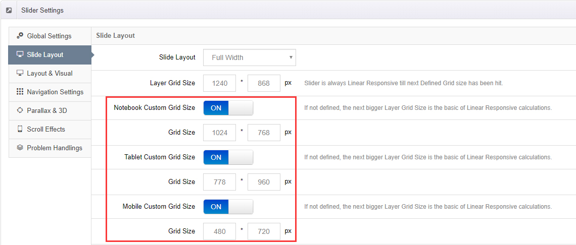
Slide Layout
Auto
The default "responsive" layout. The slider will always inherit the width of its immediate HTML container, allowing it to fit seamlessly inside your theme's page layout.
Full Width
The slider will always stretch across the entire width of the screen.
Full Screen
The slider will always become the same size as the entire screen.
Layer Grid Size
The default Canvas Size for your slider's content. Layer alignment and positioning are designed against this grid.
Custom Grid Sizes
To enable the ability to design content for multiple screen sizes, first set "Custom Grid Size" to "ON".
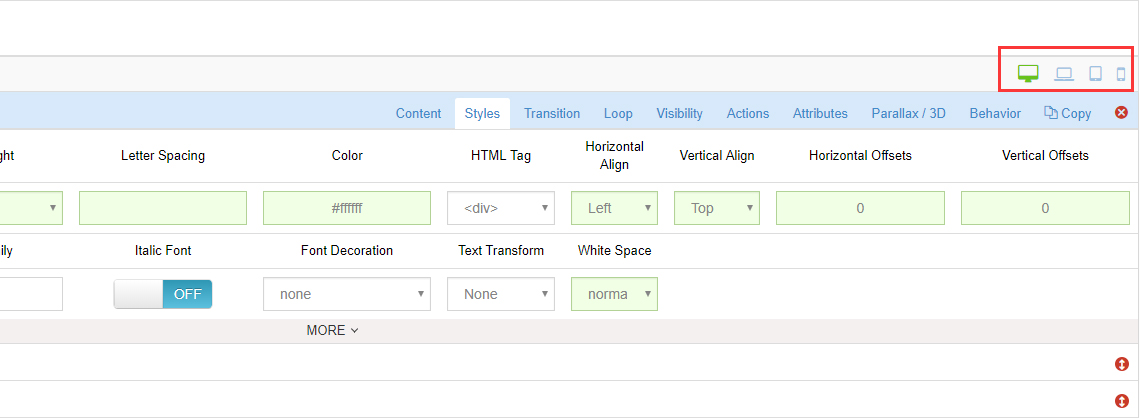
Once you've activated at least one "Custom Grid Size", when you edit a slide, you can set different styles (such as varying font-sizes) for each enabled "Custom Grid Size".
Min. Height
Sometimes a slider can be quite wide with a short height. But when the slider is resized down, the short height may become too short. In these cases, applying a "min-height" value will ensure that the slider never becomes too short when it's resized down.
Next Steps
- Layout & Visual — shadow, spinner and mobile options
- Slide Layers — layer alignment and grids