Navigation
The Navigation Settings control the slider's arrows, bullets, tabs and thumbs, as well as touch and keyboard interaction.
Common Options: Visibility & Position
Arrows, Bullets, Tabs and Thumbs all have similar "Visibility" and "Position" options, described here once for brevity.
Visibility
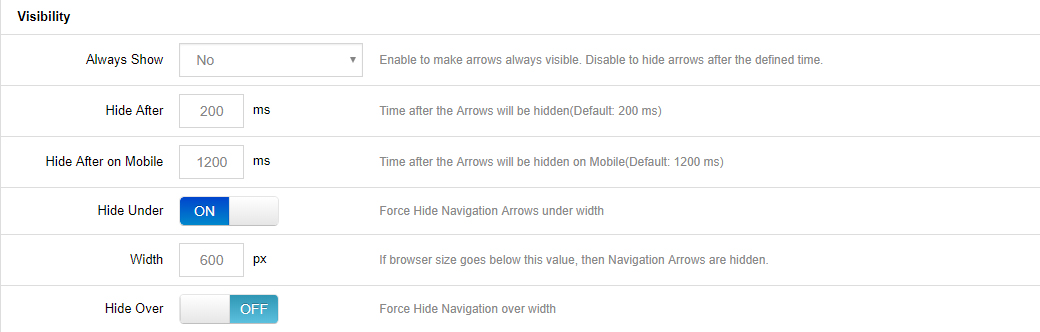
- Always Show: Yes = show the navigation element at all times; No = only show on mouse hover.
- Hide Under Width: Disable the navigation element below a certain screen width. For example, thumbnails look great on desktop, but are often better hidden on smaller screens.
- Hide After on Mobile: The amount of time in milliseconds before the navigation fades out of view after a "tap" occurs on mobile devices.
- Hide Over Width: Disable the navigation element above a certain screen width.
Position
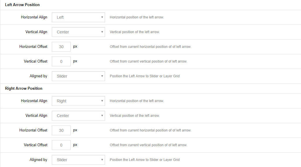
- Horizontal Align / Horizontal Offset: Align the navigation to the left, right or center of the slider; apply a left/right margin in relation to the horizontal alignment (positive and negative numbers supported).
- Vertical Align / Vertical Offset: Align the navigation to the top, bottom or middle of the slider; apply a top/bottom margin in relation to the vertical alignment (positive and negative numbers supported).
- Aligned by: Choose whether the navigation elements should align themselves based on the entire slider's area, or always be confined to the "Layers Grid".
Arrows
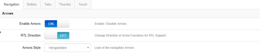
- Enable Arrows: Choose to enable/disable navigation arrows.
- RTL Direction: Change the direction of arrow functionality for RTL support.
- Visibility, Left/Right Arrow Position: see the common options above.
Bullets
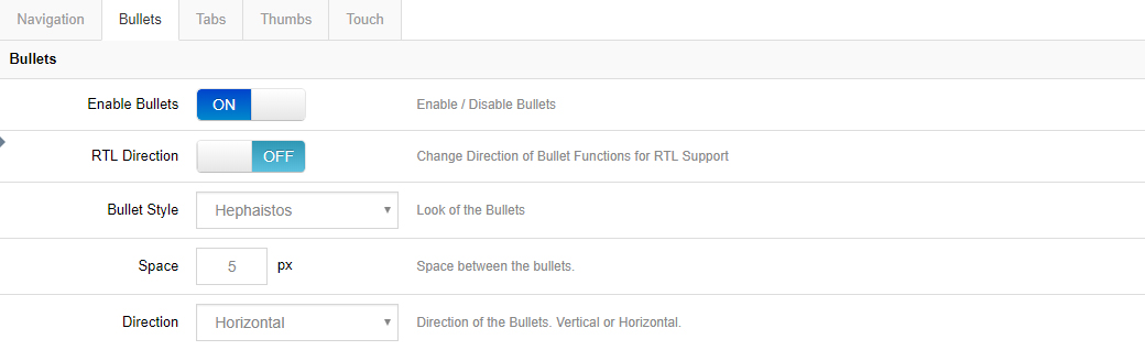
- Enable Bullets / Bullet Style: Choose to enable/disable bullets, and if enabled, choose between 15 different pre-built styles.
- RTL Direction: Change the direction of bullet functionality for RTL support.
- Space / Direction: Set the spacing between the bullets in pixels, and choose whether the bullets are displayed horizontally (side by side) or vertically (stacked).
- Visibility, Position: see the common options above.
Tabs / Thumbs
Tabs and Thumbs share the exact same options, combined here for brevity.
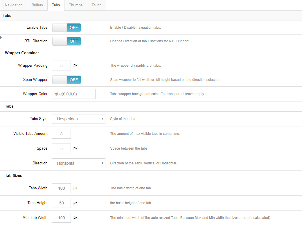
- RTL Direction: Change the direction of tab/thumbnail functionality for RTL support.
Wrapping Container
- Wrapper Padding: Space between the edge of the slider and the edge of the thumbs/tabs container.
- Span Wrapper: ON = thumbs/tabs will always be stretched across the full size of the slider; OFF = stretched to the slider's Layers Grid.
- Wrapper Color: Adjust the color and opacity of the tab/thumbs section. Only visible if either "Space" or "Wrapper Padding" exists.
Style, Visible Amount, Space & Direction
- Style: Choose between 5 different pre-built styles.
- Visible Amount: The amount of thumbs or tabs that will be visibly shown. For example, if you have 7 slides but only want 3 thumbnails displayed, the thumb strip will still contain 7 items, but only 3 thumbs will be visible at any given time, with the additional thumbs shown on mouse movement.
- Space / Direction: Set the spacing between the tabs/thumbs in pixels, and choose horizontal (side by side) or vertical (stacked) display.
Width, Height, Min. Width
Set the tab/thumb width and height. The width acts as a "Max Width", and the height resizes proportionally.
For example, let's say the slider itself was resized down by 50% for mobile. If the thumb width/height were set to 100×50, the thumb size would also be resized down by 50%, and the new thumb width/height would be 50×25. However, this is where the "Min Width" value is useful: if the "Min Width" were also set to "100px", the thumbnails would never resize down.
- Visibility, Position: see the common options above.
Touch
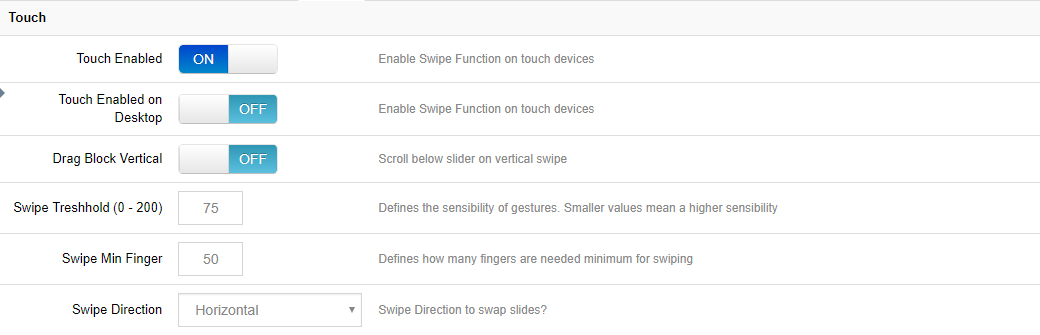
- Touch Enabled: Choose to enable/disable touch navigation for mobile. If enabled, swiping the slider left or right with your finger will change slides back and forth.
- Drag Block Vertical: Allow the page to be scrolled vertically when "touch" is enabled. When "ON", "swiping" the slider in a vertical direction also scrolls the page itself; when "OFF", the page will not scroll when swiping the slider vertically.
- Swipe Threshold: The swipe action sensitivity. A smaller number means only a short "swipe" is needed for the slide to change; a larger number means a more elaborate "swipe" is required.
- Min. Finger: The number of fingers needed for a "swipe" action to be registered. "1" finger is usually best, as that's what most users are used to, but depending on your site you can require two fingers, etc.
- Swipe Direction:
- Horizontal: Traditional left-to-right touch-swipe navigation.
- Vertical: Useful when your slide animations are set to "Slide Vertical (Next/Previous)" — swiping up or down changes the slides.
Misc

- Keyboard Navigation: Choose to enable arrow keys to navigate between slides.
- Key Direction: Vertical = up and down keys act as "next/previous" controls; Horizontal = left and right keys act as controls.
- Mouse Scroll Navigation: Capture mouse-wheel movement to change between slides.
- Reverse Mouse Scroll: Reverse the direction that the slides change when the mouse wheel is used.
Next Steps
- General — slideshow behavior and progress bar
- Parallax & 3D — parallax configuration