Event List Skins
Event list skins control how the front-end event list is presented. Open Event List Skins → Skin List to choose one.
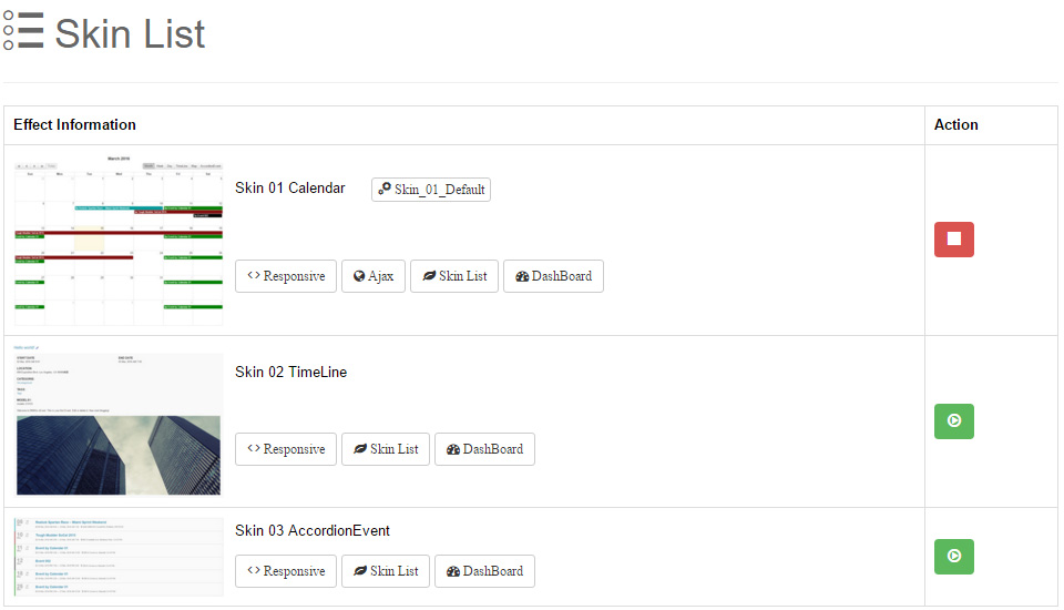
Choosing a Skin
Each skin appears as a card: a preview image on the left, the skin name, current theme and feature tags on the right.
- Action column: the skin currently in use shows a red stop icon (not clickable); other skins show a green play icon — click to switch.
- Theme button: the active skin displays its theme name (e.g. Skin_01_Default); click to jump straight to Skin Options.
- Feature tags: Responsive, Ajax, Skin List, DashBoard.
- After switching skins, the options on the Options page change accordingly.
Built-in Skins
Three skins ship with the module:
| Skin | Features | Demo |
|---|---|---|
| Skin 01 Calendar | Responsive, Ajax, Skin List, DashBoard | Live Demo |
| Skin 02 TimeLine | Responsive, Skin List, DashBoard | Live Demo |
| Skin 03 AccordionEvent | Responsive, Skin List, DashBoard | Live Demo |
Skin_01_Calendar
A full-featured calendar skin with smooth AJAX-driven month navigation. Beyond the month grid, the skin ships several view modes enabled through Display View / Default View in the Skin Options:
- Month, Week, Day — classic calendar views
- Time Line — timeline list view
- Map — shows event venues on a map
- Accordion — day-grouped collapsible list
Every view has its own settings section on the Options page (Basic Options, Tooltip Settings, Time Line Settings, Map Settings, Accordion Settings) — see Skin Options.
Themes
Switch color schemes via Theme Name in Options → General Settings.
Skin_02_TimeLine
A list skin with the timeline as its main view, ideal for browsing events chronologically. Main options include pagination, display size, summary length, date formats and display switches for title, date, timezone, location, category, tag, summary, content and image.
Skin_03_AccordionEvent
A skin with the accordion list as its main view — grouped by day, collapsible. Options resemble the timeline skin and additionally support title-row elements (left date, title date, etc.).
Shared Options
All three list skins share these options:
- Sort by: event ordering (Start Time ASC / DESC).
- Date Format / All Day Date Format: date display formats — see Date Format for tokens.
- Display RSS: show the RSS icon.
Filter by category/feature
When a list skin is applied in the Dashboard module, the Options additionally provide a Data Filter panel (Choose Categorie multi-select, Feature only).
See Skin Options for the full option reference.