

Content Layouts
The theme includes every content layout used on the demo site. Edit them, or build your own.
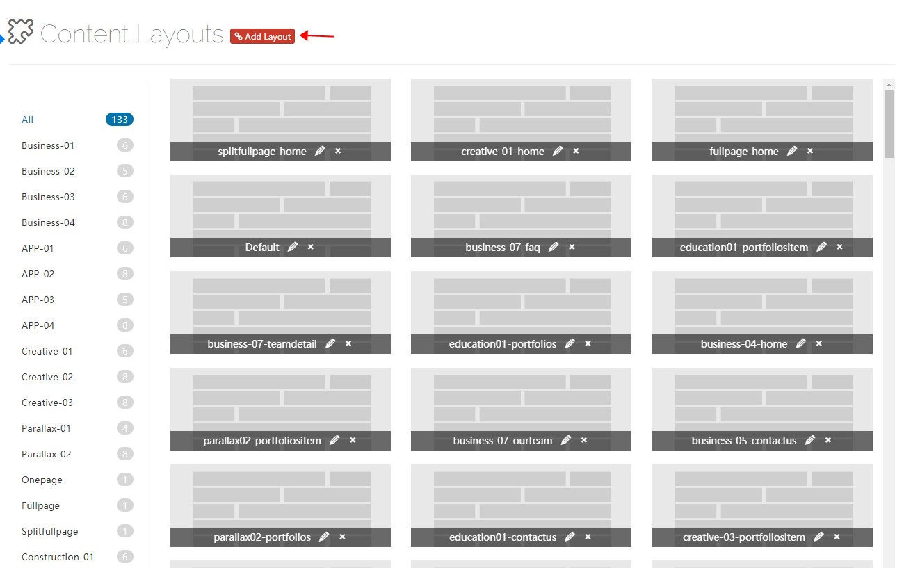
Control Panel Area
Click Add Layout to open the content layout control panel. It contains several default layouts you can modify or delete — remember to save when you are done.
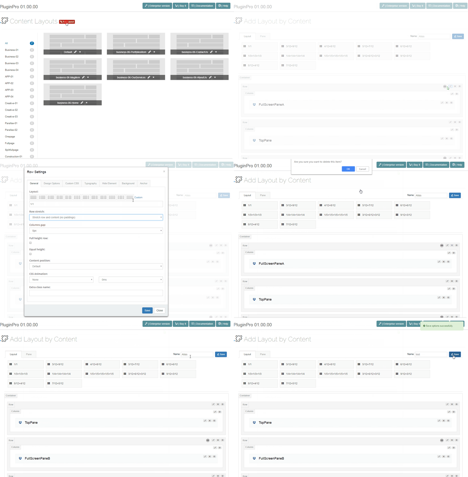
Layout
Pick the layouts you need and drag them into the container.
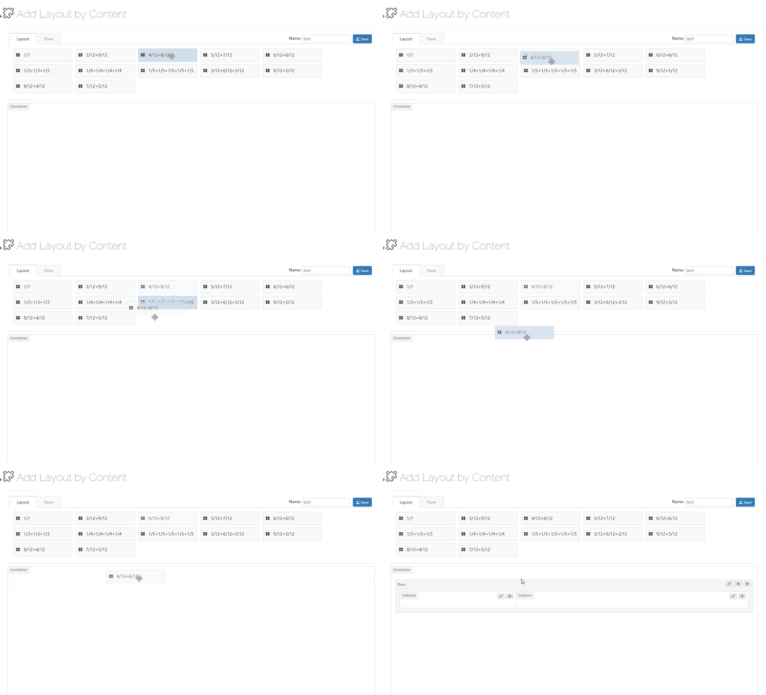
Pane
Panes are the containers that let a page host modules. Drag them into columns.
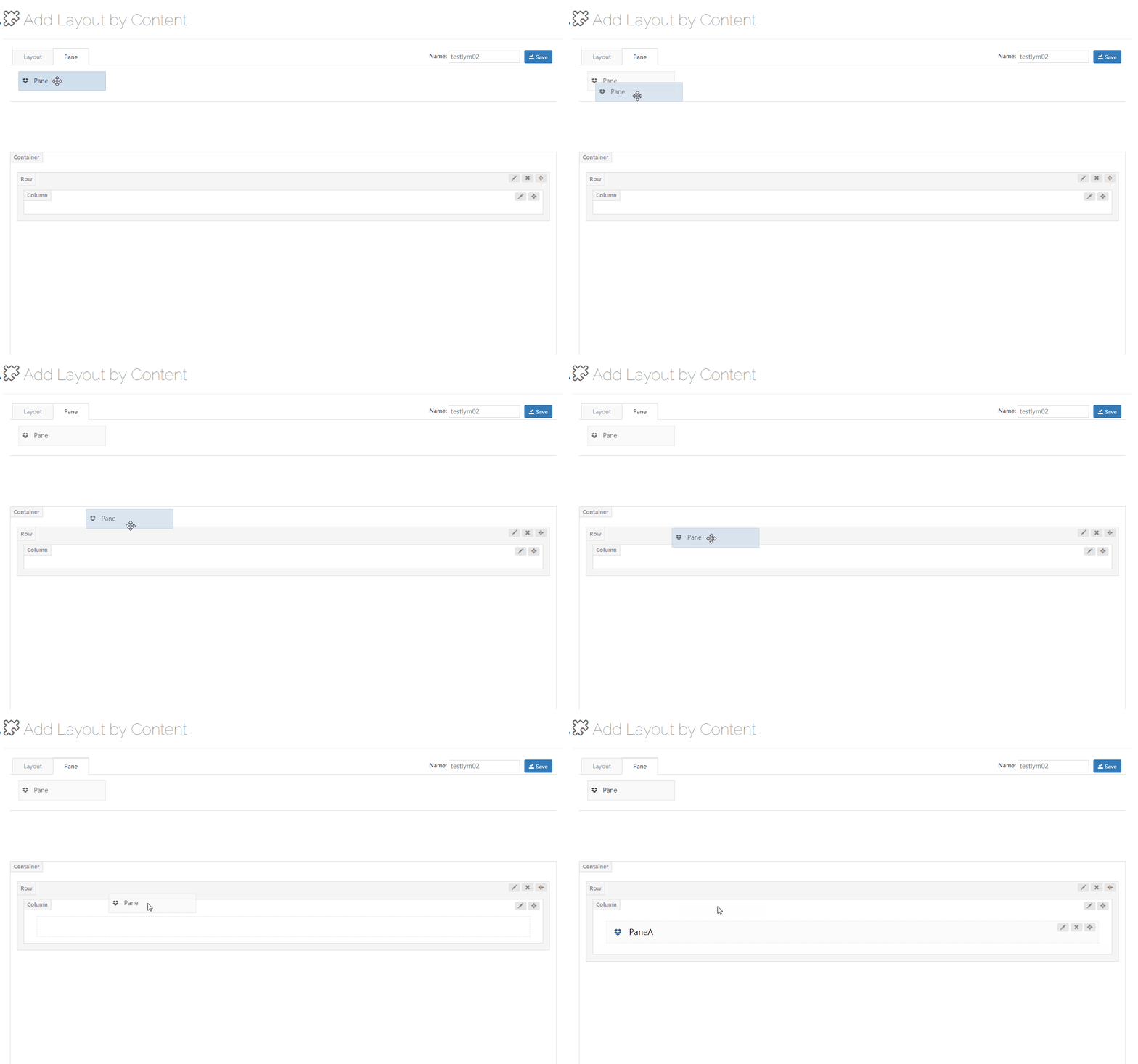
Pane Settings
| Setting | Description |
|---|---|
| Pane Name | Name of the pane |
| Design Options | Background color, background image, border, padding and margin of the pane |
| Custom CSS | Apply pre-built theme CSS to the pane |
Row Settings
Click the edit button on the right of a row to open its settings.
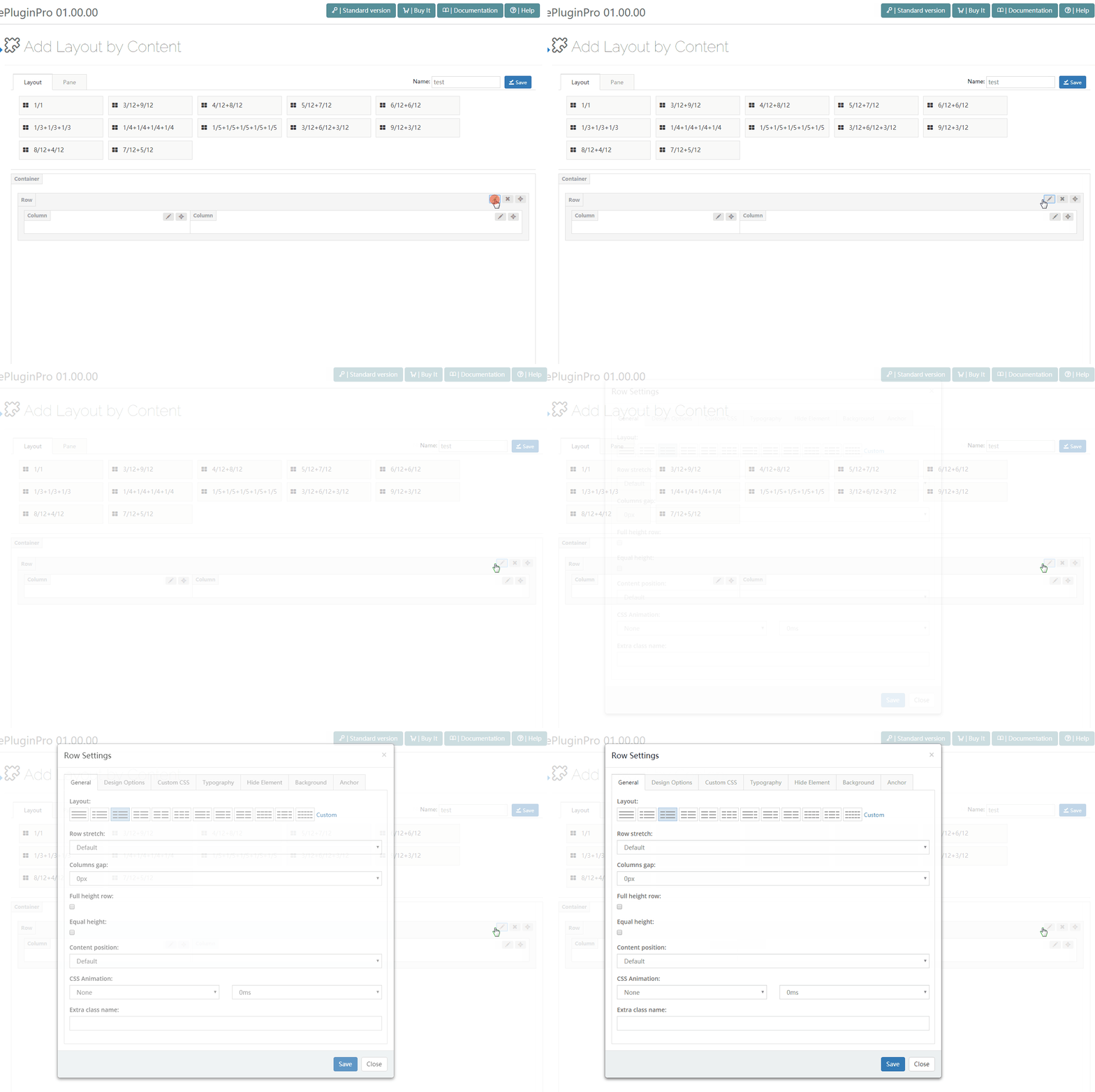
General
| Setting | Description |
|---|---|
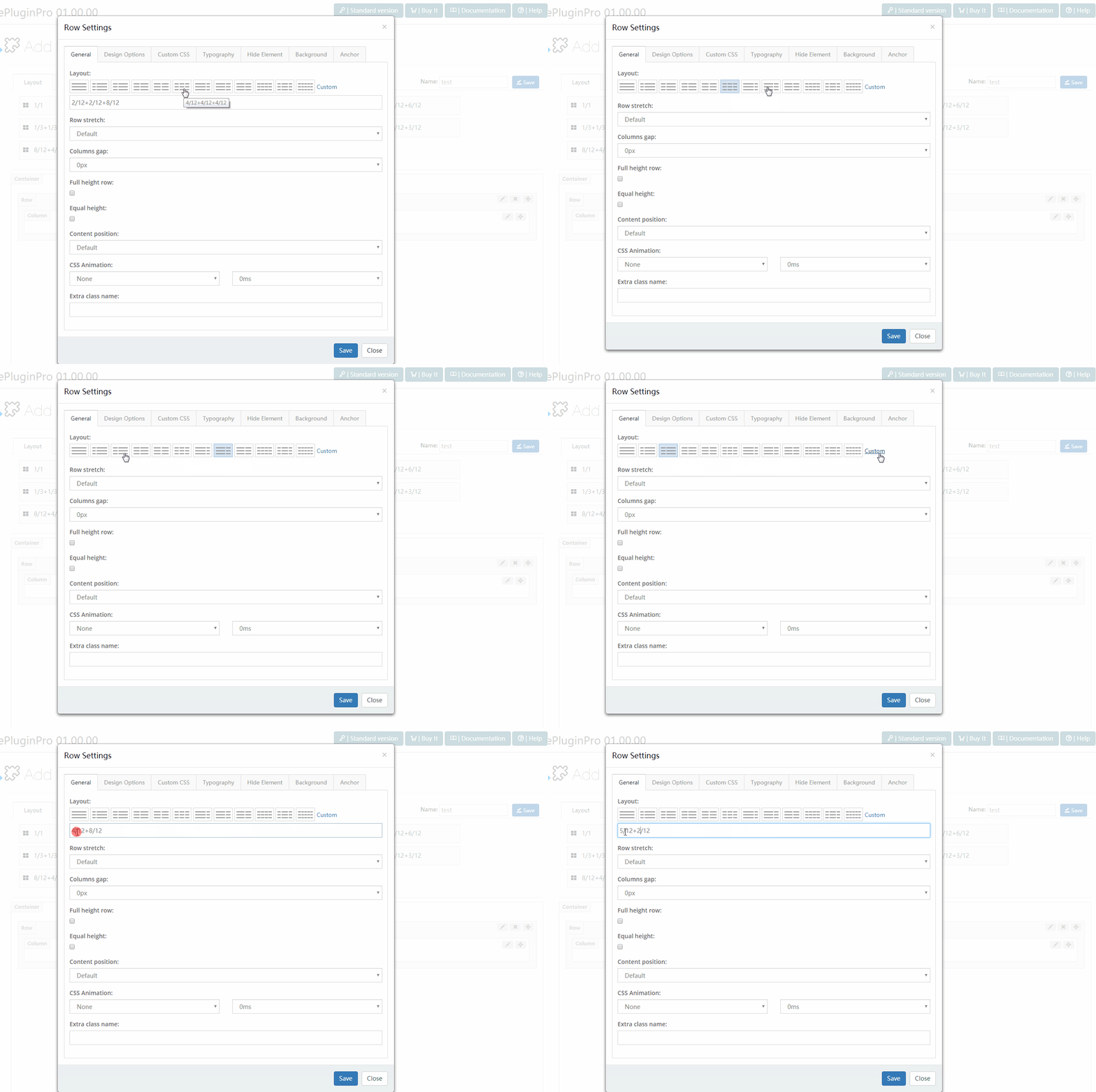
| Layout | Click an icon to pick a column split, or define a custom one. Custom splits accept 1/12 through 12/12, plus 1/5 through 5/5 |
| Setting | Description |
|---|---|
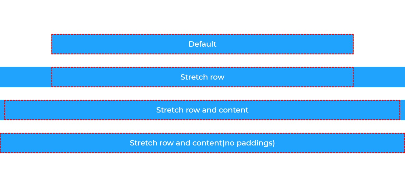
| Row stretch | How the row stretches — 4 modes, see below |
| Mode | Description |
|---|---|
| Default | Content width matches the theme width |
| Stretch row | Row spans the full width; content keeps the theme width |
| Stretch row and content | Row and content span the full width, with extra padding on the sides |
| Stretch row and content (no paddings) | Row and content span the full width with no padding |
| Setting | Description |
|---|---|
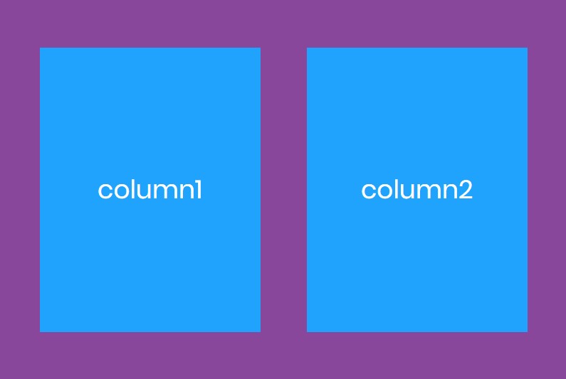
| Full height row | Row height matches the browser window |
| Equal height | All columns of the row share the same height |
| Setting | Description |
|---|---|
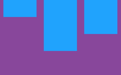
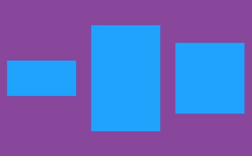
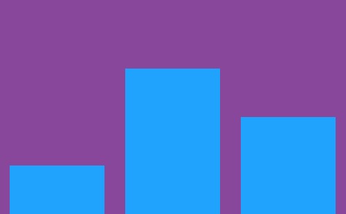
| Content position | Vertical alignment of the column content |
top:
middle:
bottom:
| Setting | Description |
|---|---|
| CSS Animation | An entrance animation for the row — pick the effect and its duration |
| Extra class name | Extra CSS class names for the row |
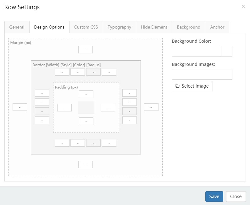
Design Options
Padding, margin, borders, background color and background image of the row.
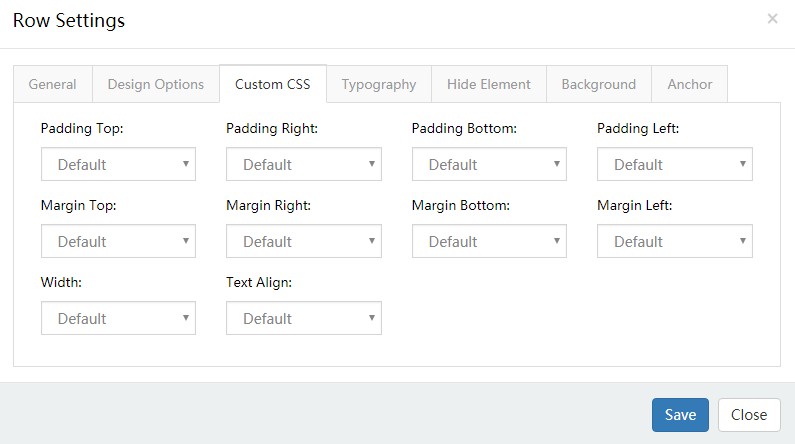
Custom CSS
Apply pre-built theme CSS to the row.
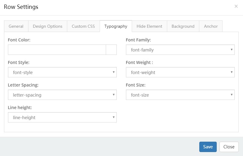
Typography
Text styling of the row — size, color, font family and more.
Hide Element
Hide the row below chosen resolutions.
Background
| Setting | Description |
|---|---|
| Background Style | One of the 5 styles below |
1. Single Color — a solid background color.
2. Gradient Color — a gradient background.
| Setting | Description |
|---|---|
| Gradient Type | Direction of the gradient |
| Gradient Start Color | Start color |
| Gradient End Color | End color |
3. Image — a background image.
4. Parallax — a parallax background image.
| Setting | Description |
|---|---|
| Parallax Style | Fixed at its position, or Parallax on scroll |
| Parallax Factor | With Parallax on scroll: how far the background shifts, configurable per resolution |
5. YouTube Video — a YouTube video as the background.
| Setting | Description |
|---|---|
| YouTube ID | The video ID. Open the video on YouTube and copy the part of the URL after v= — for https://www.youtube.com/watch?v=AkcUoA2f-jU the ID is AkcUoA2f-jU |
| Placeholder Images | Cover image of the video |
| Loop | Loop the video |
| Muted | Mute the video |
| Start Time(s) | Start time |
| End Time(s) | End time |
| Play video only when in viewport | Play only when the video scrolls into view |
| Display Color Overlay | Add a shade layer over the video, with adjustable color and opacity |
| Enable slanted background | Slant the background, with an adjustable angle |
Anchor
| Setting | Description |
|---|---|
| Anchor ID | The anchor ID |
| Anchor Title | The title text |
What anchors are for
Anchors drive the dot navigation of the One Page / Full Page page types — see How To.
Column Settings
Click the edit button on the right of a column to open its settings.
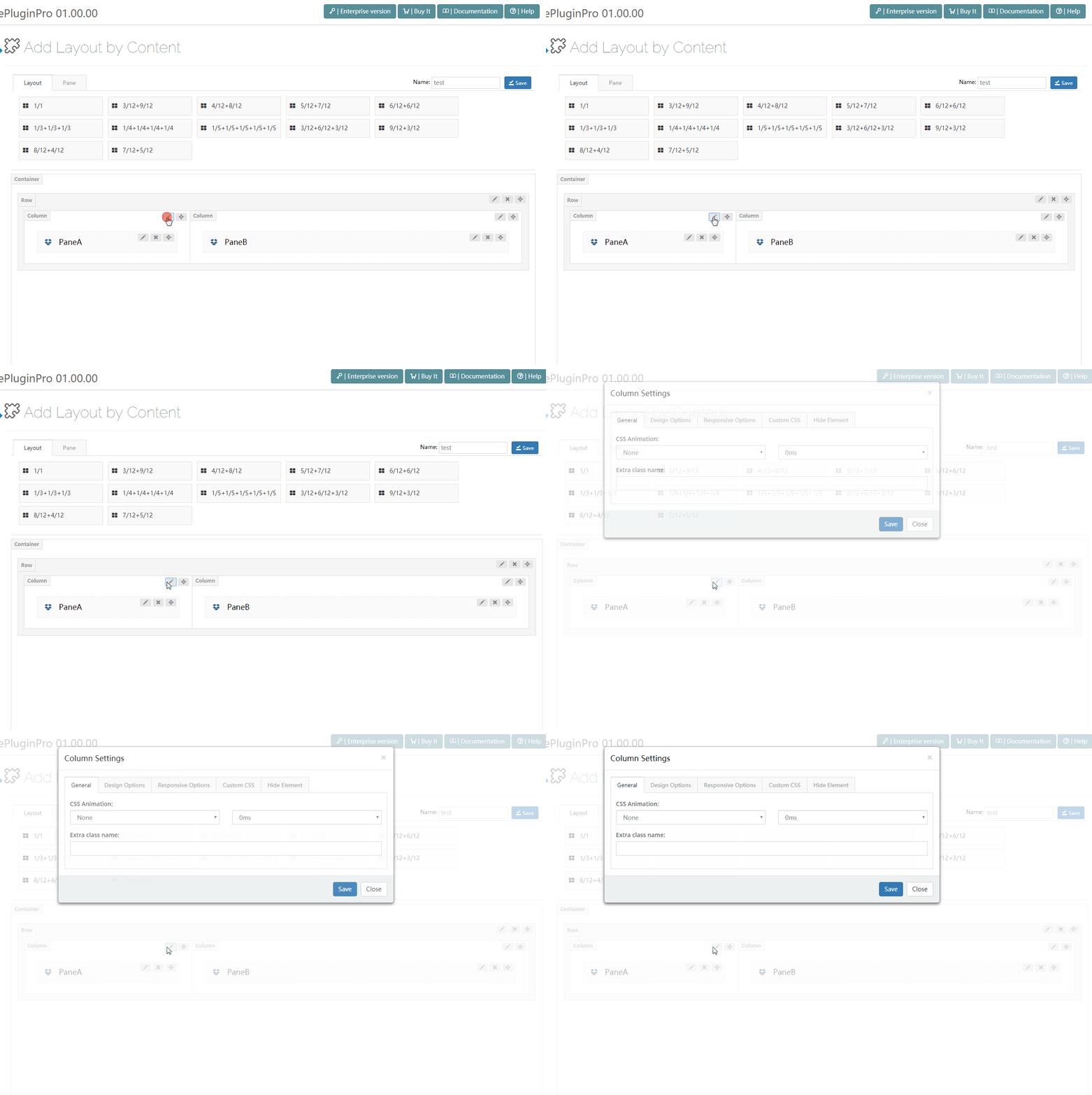
General
| Setting | Description |
|---|---|
| CSS Animation | An entrance animation for the column — pick the effect and its duration |
| Extra class name | Extra CSS class names for the column |
| Design Options | Background color, background image, padding, margin and borders of the column |
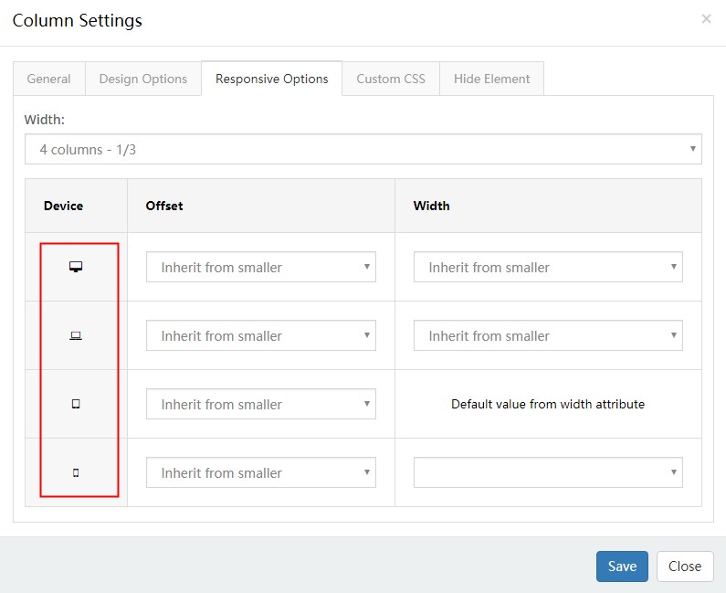
Responsive Options
Configure the column per resolution.
| Setting | Description |
|---|---|
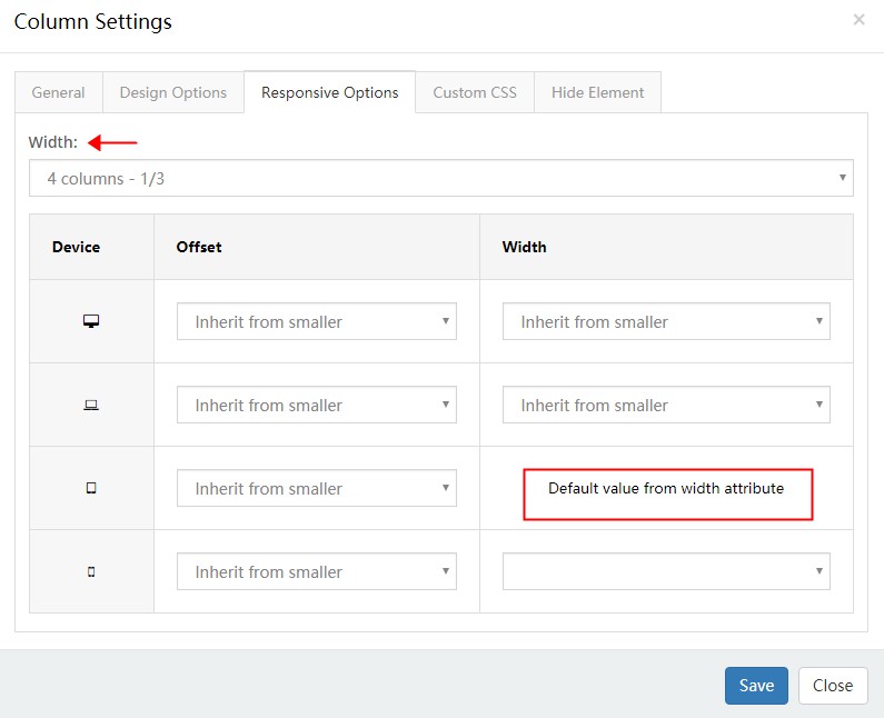
| Width | Width of the column |
| Setting | Description |
|---|---|
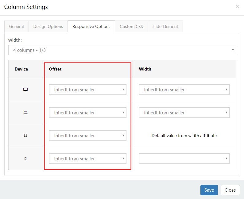
| Offset | Offset of the column |
| Setting | Description |
|---|---|
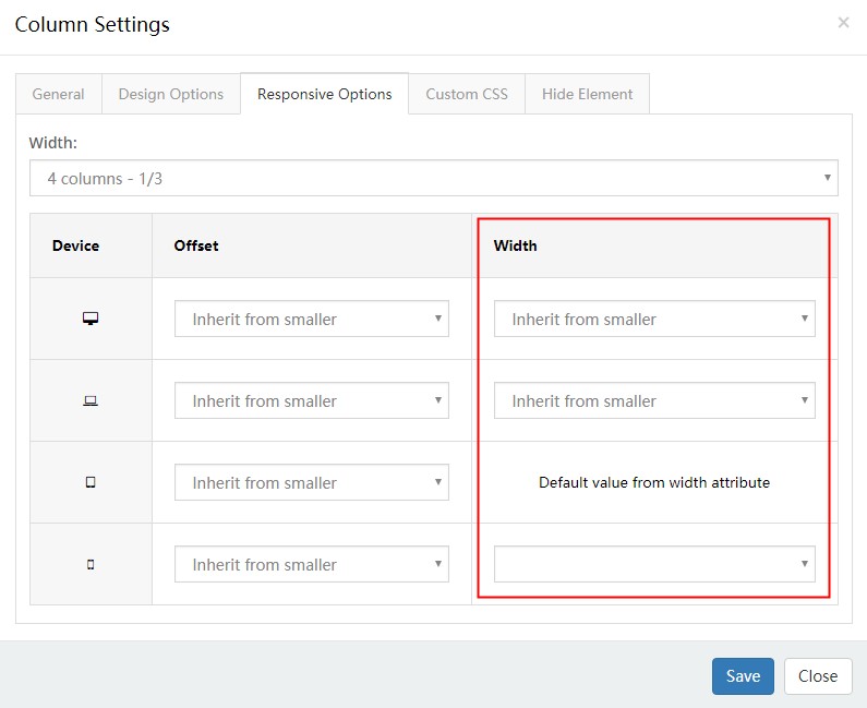
| Width | Column width per resolution — mobile defaults to full width |
Custom CSS
Apply pre-built theme CSS to the column.
Hide Element
Hide the column below chosen resolutions.