
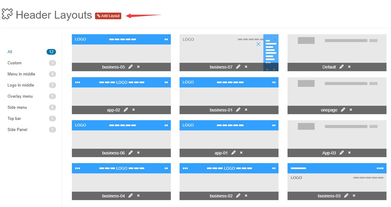
Header Layouts
The theme includes every header layout used on the demo site. Edit them, or build your own.
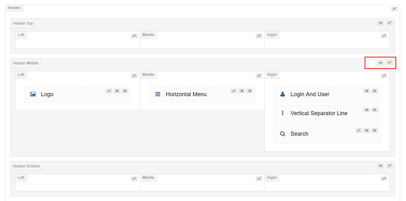
9 Grids Area
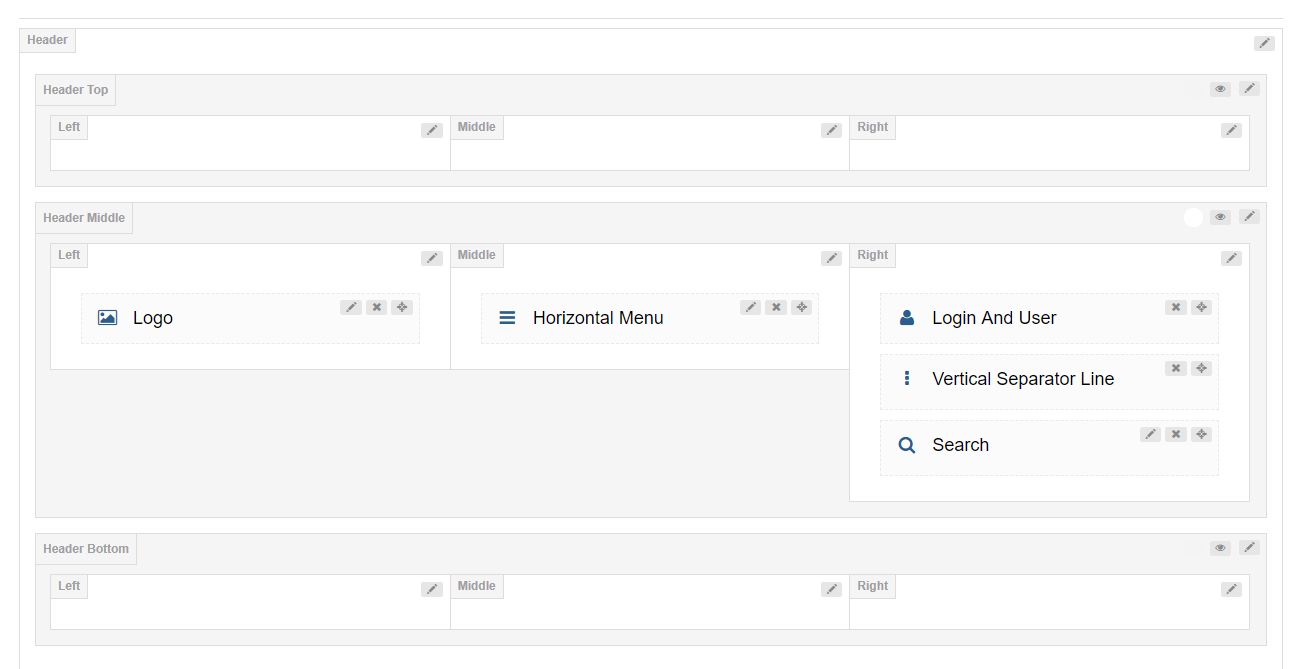
The header is divided into 3 rows of 3 columns each. Add controls to any row.
Header Settings
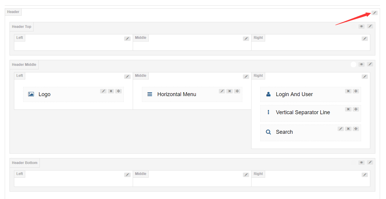
Click the edit icon to open the header settings.
| Setting | Description |
|---|---|
| Header Position | Float the header above the banner or page title |
| Sticky Header | Keep the header pinned to the top while the page scrolls |
| Sticky Header Type | The look of the sticky header |
Header (Top / Middle / Bottom) Settings
The header top and header bottom rows are hidden by default. Click the eye icon to enable them, or the edit button to configure them.
General
| Setting | Description |
|---|---|
| Row Height (px) | Height of the header row |
| Layout | Width of the header content — full width or fixed width |
| Area Space (px) | Spacing between the left, middle and right columns |
| Distance Between Controls (px) | Distance between controls inside a column |
| Split Line Between Grids | Show divider lines between the grids |

| Setting | Description |
|---|---|
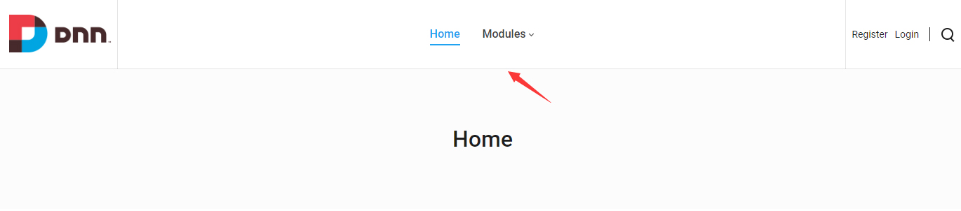
| Bottom Line | Show a divider line at the bottom of the row |
| Setting | Description |
|---|---|
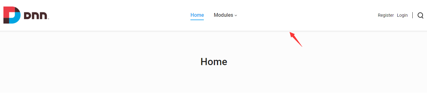
| Display Shadow | Show a soft gray shadow under the row |
| Setting | Description |
|---|---|
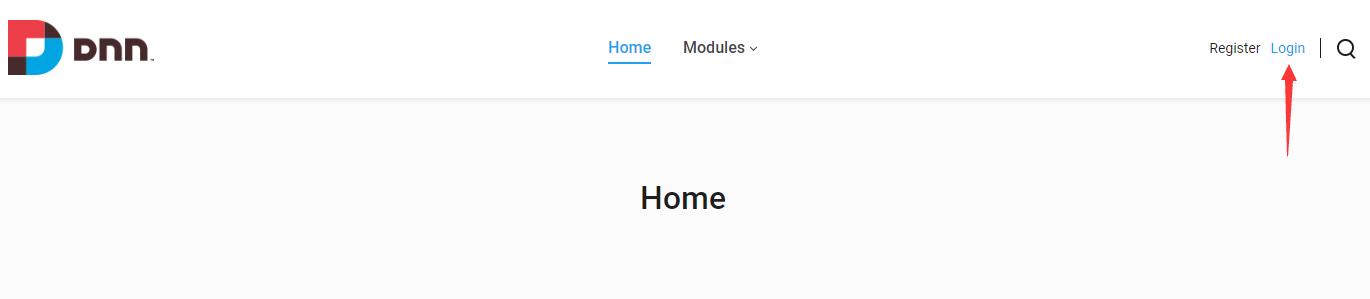
| Accent Color | Accent color of the row — the color used on hover and active states |
| Extra class name | Extra CSS class names for the row |
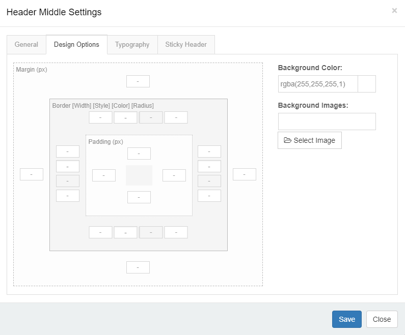
Design Options
Padding, margin, borders, background color and background image of the header row.
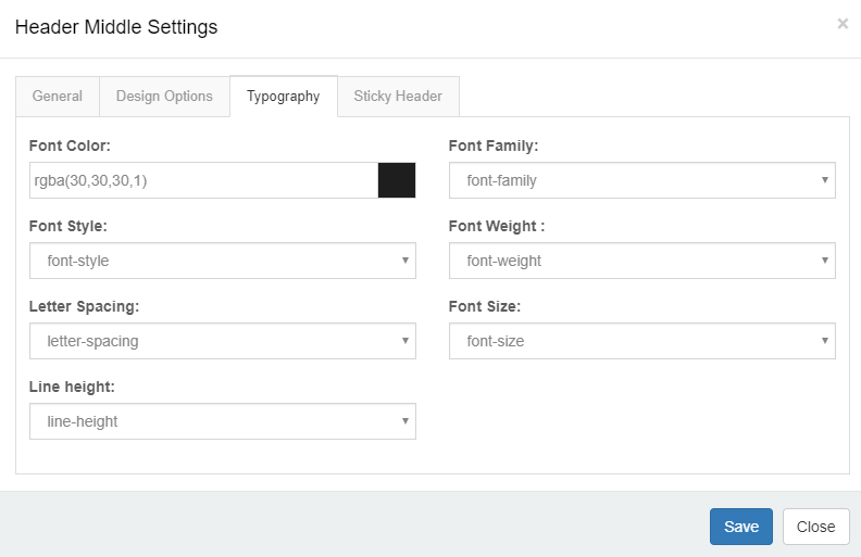
Typography
Text styling of the header row — size, color, font family and more.
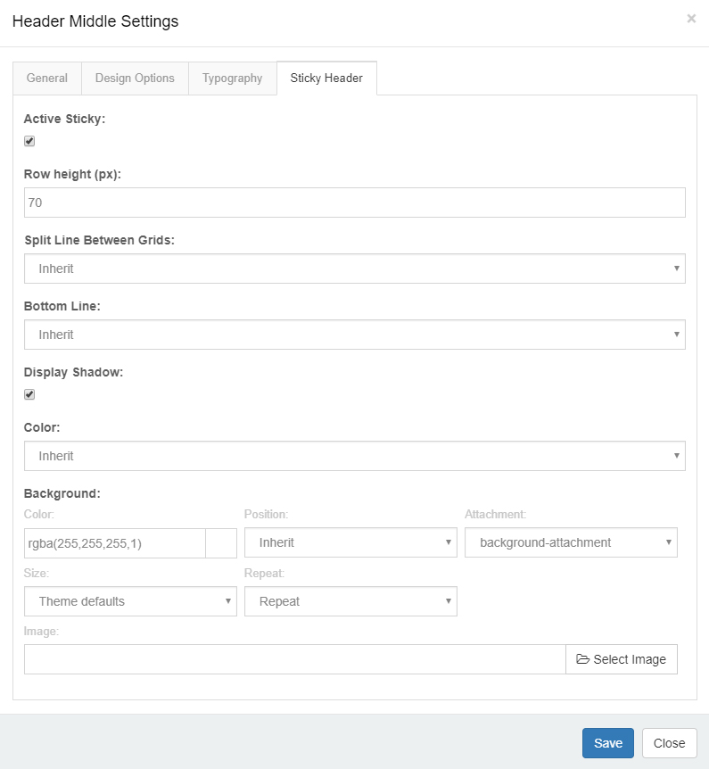
Sticky Header
Decide whether the row appears in the sticky header, and style it there.
Header Column Settings
General
| Setting | Description |
|---|---|
| Column width | Width of the column |
| Arrangement | Stack the controls vertically or lay them out horizontally |
| Text Align | Text alignment inside the column |
Design Options
Padding, margin, borders, background color and background image of the column.
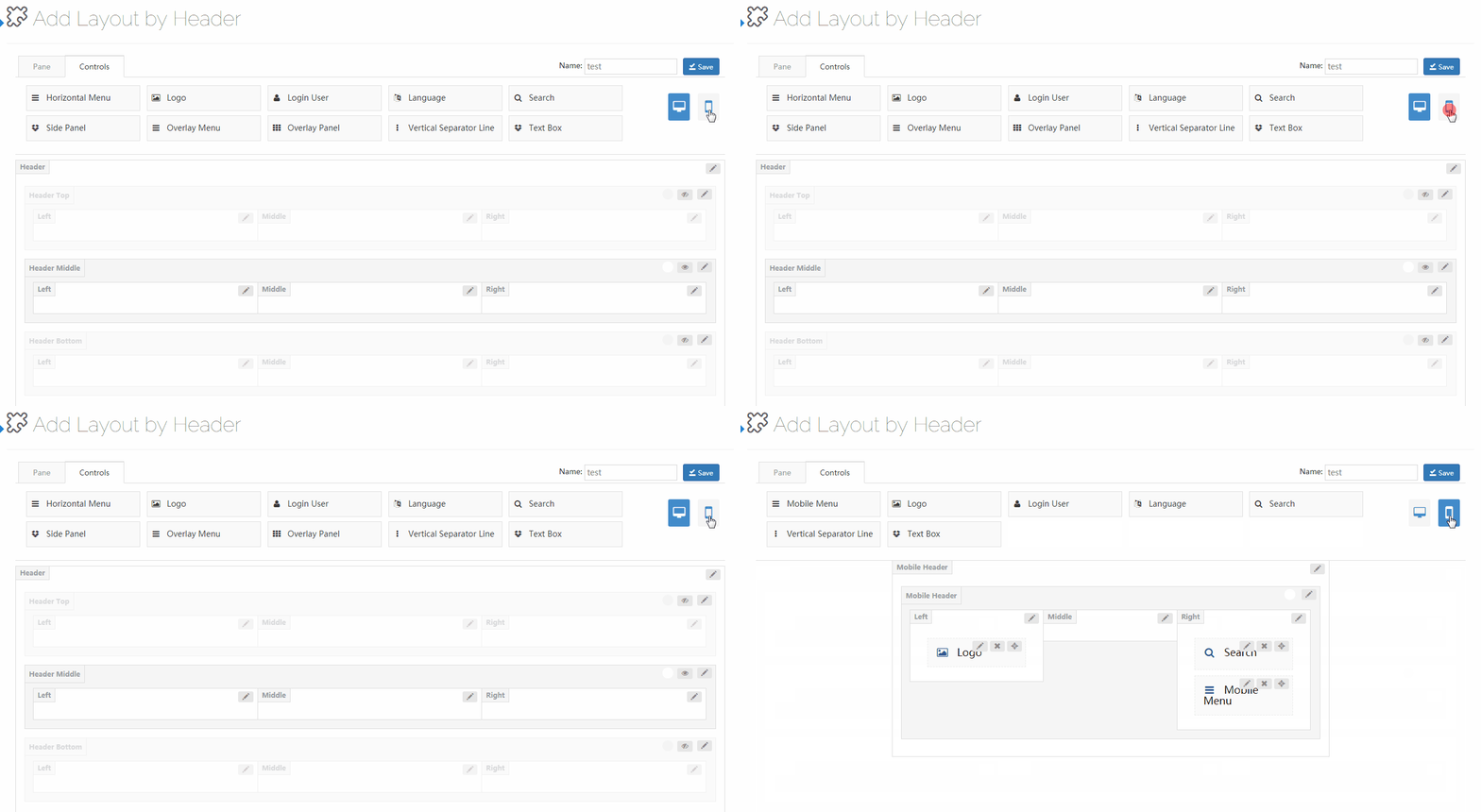
Mobile Header Settings
Click the mobile icon to switch to the mobile header layout. The mobile header is divided into left, middle and right areas, each holding its own controls and panes.
Controls
Controls are the custom modules of the theme — drag them wherever you need them.
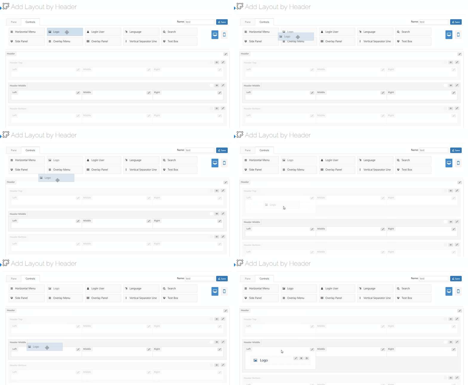
Click the edit button next to a control to open its settings.
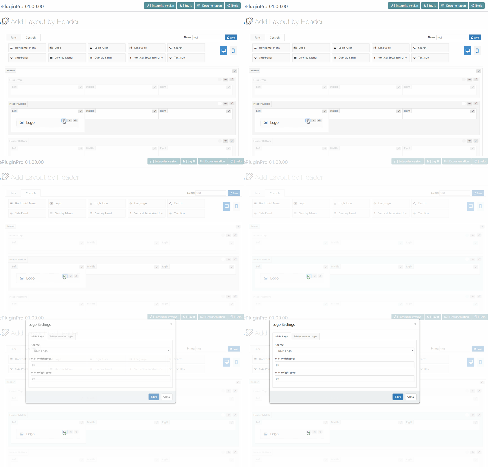
Logo
The Logo control displays your logo in the header.

Its settings have two parts: the main logo and the sticky header logo.
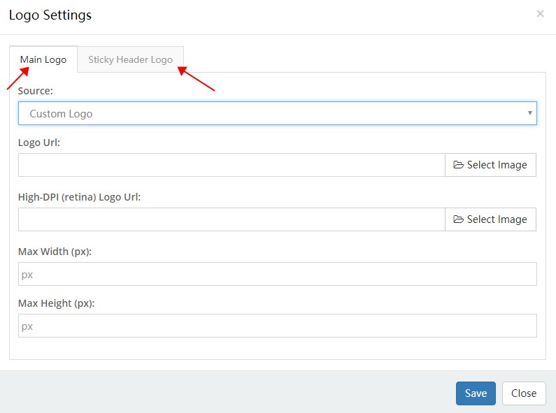
Main Logo
| Setting | Description |
|---|---|
| Source | Use the DNN site logo (set under Admin > Site Settings) or a custom logo |
| Logo URL | The custom logo image |
| High-DPI (retina) Logo URL | Logo for high-DPI screens. The file name must end with -2x, e.g. logo-d-2x.png |
| Max Width | Maximum width of the logo |
| Max Height | Maximum height of the logo |
Sticky Header Logo
| Setting | Description |
|---|---|
| Source | Where the sticky header logo comes from |
Horizontal Menu
The Horizontal Menu control displays the navigation menu in the header.

Its settings cover three areas: the main menu, the flyout menu and the mega menu.
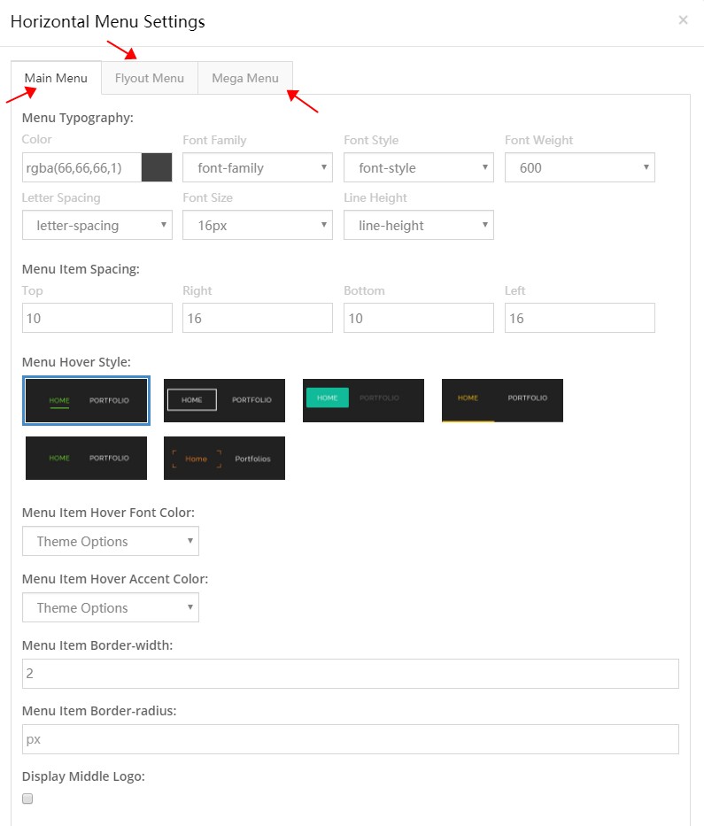
Main Menu
| Setting | Description |
|---|---|
| Menu Typography | Text style of the first-level items — size, color, font and more |
| Menu Item Spacing | Spacing around each menu item |

| Setting | Description |
|---|---|
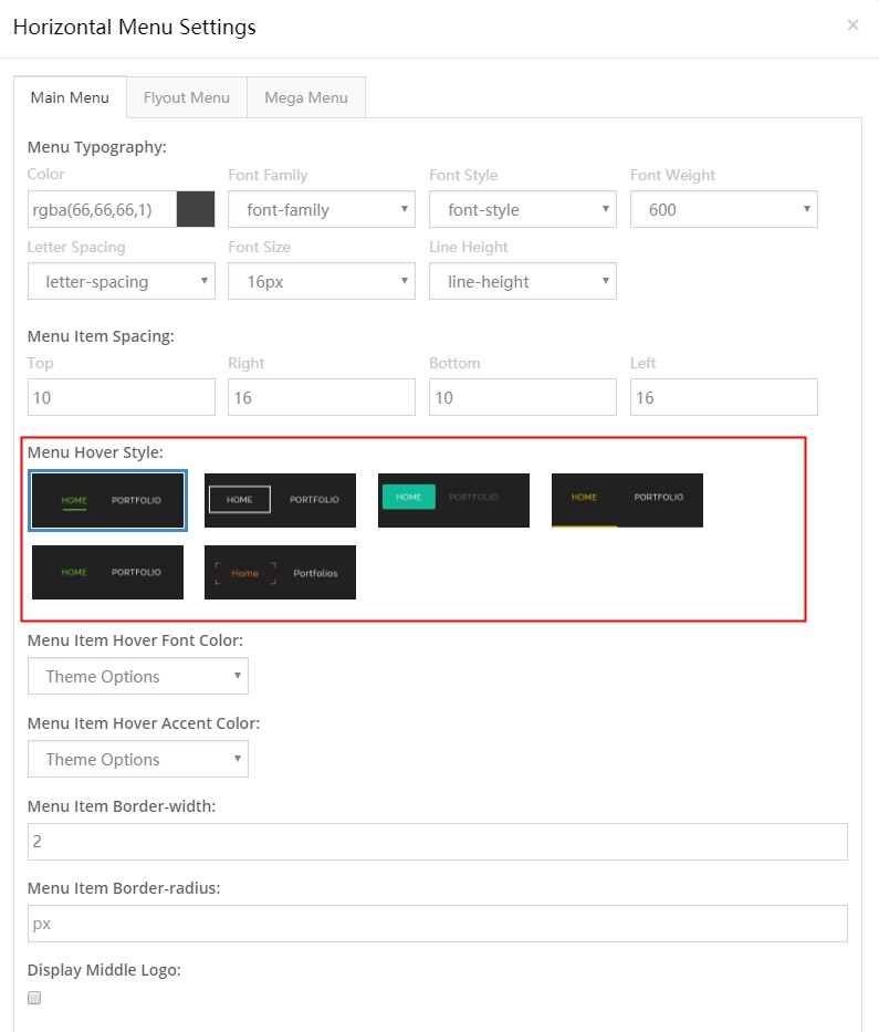
| Menu Hover Style | The hover look of the items — 6 styles to choose from |
| Setting | Description |
|---|---|
| Menu Item Hover Font Color | Text color of an item on hover |
| Menu Item Hover Accent Color | Accent color of an item on hover |
| Menu Item Border-width | Border width of menu items |

| Setting | Description |
|---|---|
| Menu Item Border-radius | Corner radius of menu items |
| Display Middle Logo | Show a logo in the middle of the menu |

Flyout Menu
| Setting | Description |
|---|---|
| Menu Typography | Text style of the pop-up menu |

| Setting | Description |
|---|---|
| Display Shadow | Show a shadow under the pop-up |

| Setting | Description |
|---|---|
| Background | Background of the sub-menus |
Mega Menu
| Setting | Description |
|---|---|
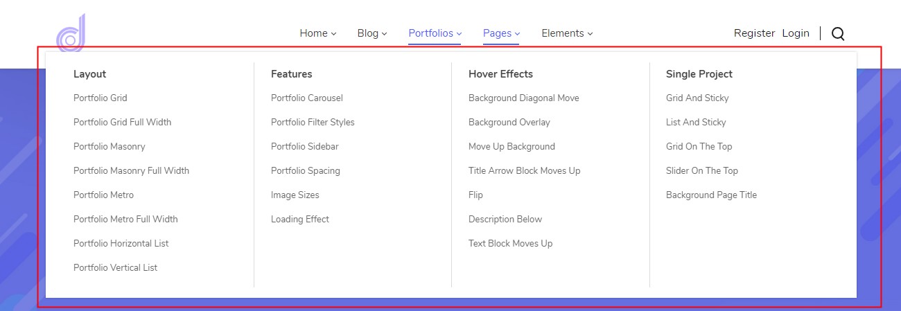
| Menu Typography | Text style of the mega menu |
| Setting | Description |
|---|---|
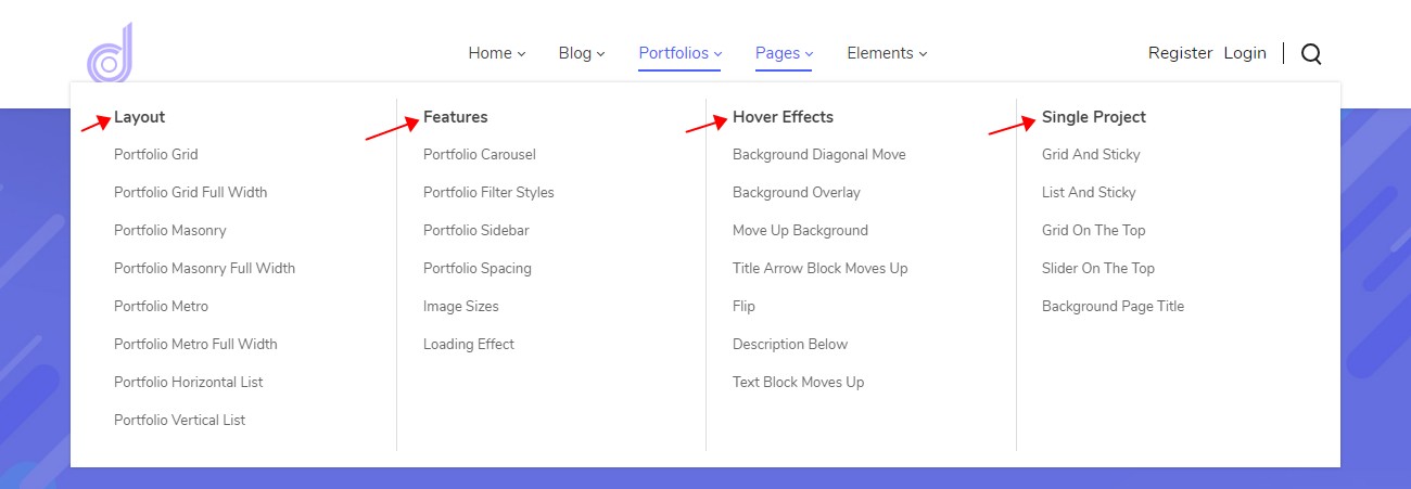
| Menu Title Typography | Text style of the group titles |
| Setting | Description |
|---|---|
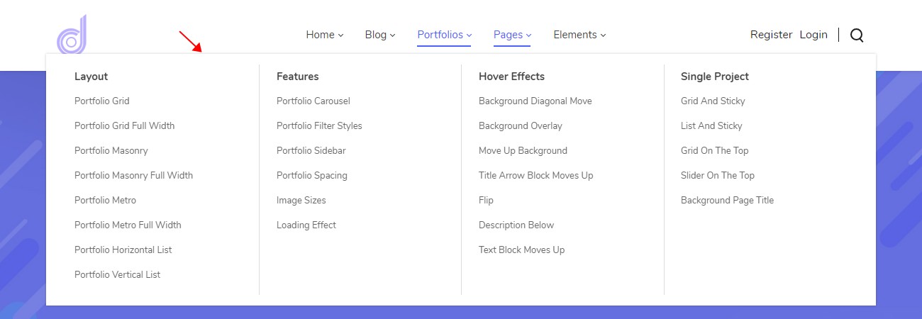
| Display Shadow | Show a shadow under the mega menu |
| Setting | Description |
|---|---|
| Line Color | Color of the vertical divider lines |
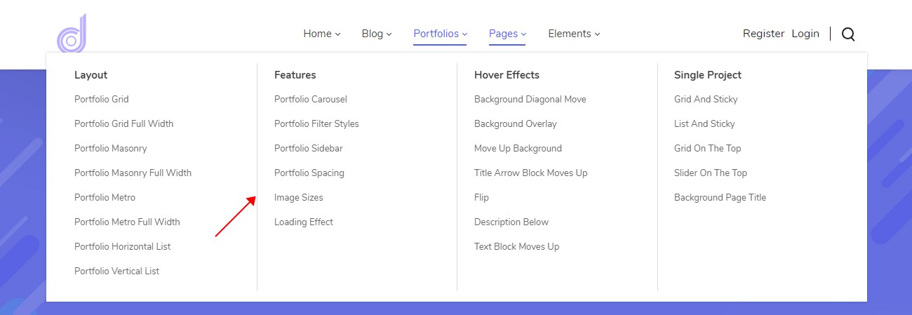
More on mega menus
For standard dropdowns, multi-column mega menus and custom menus with embedded modules, see Mega Menu.
Login User
The Login User control shows the login and register links in the header.

Its text color is set under Header Settings > Typography.
Search
Adds a search panel to the header; it slides in when the icon is clicked.
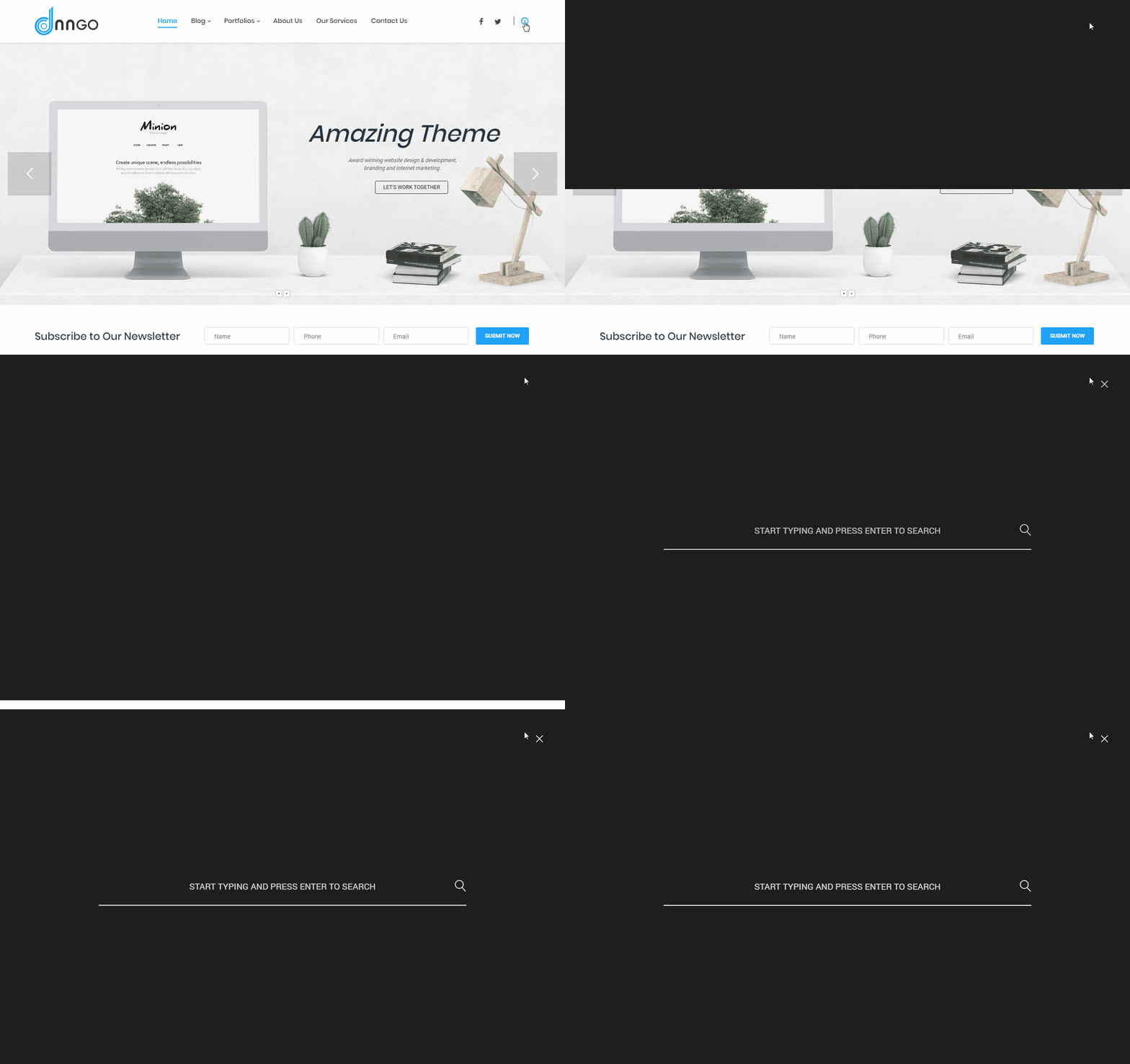
| Setting | Description |
|---|---|
| Placeholder | Placeholder text of the search box |
| Color | Dark or light search panel |
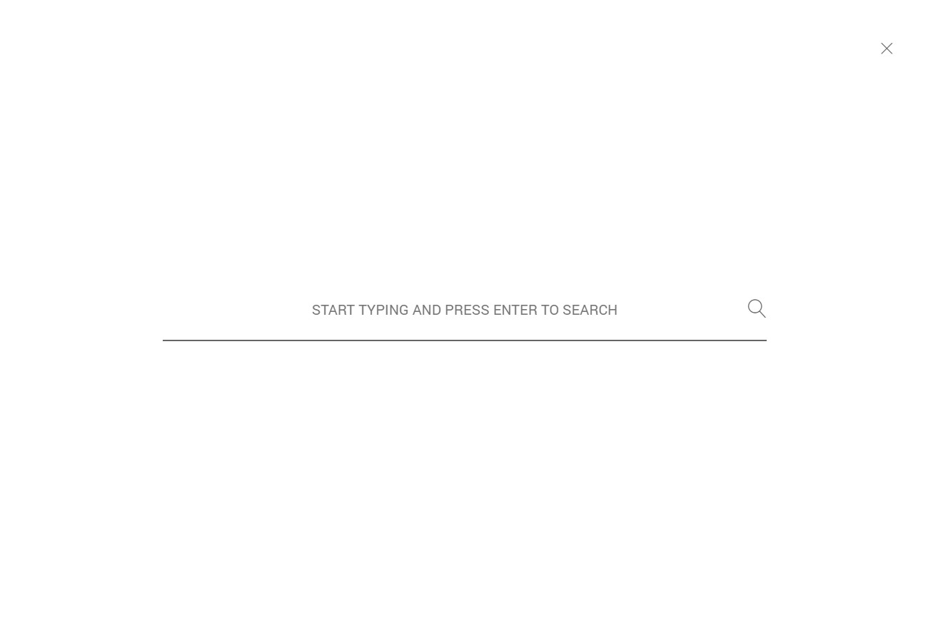
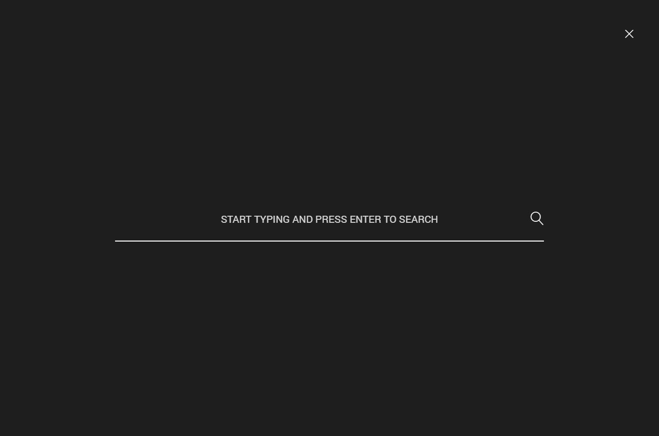
| Setting | Description |
|---|---|
| Accent Color | Accent color of the panel |
Vertical Separator Line
Adds a vertical divider to the header.

The line color is set under Header Settings > Typography.
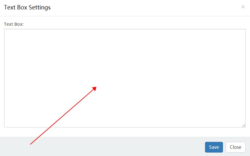
Text Box
Lets you put text or HTML code into the header.

| Setting | Description |
|---|---|
| Text Box | The code editing area |
Overlay Menu
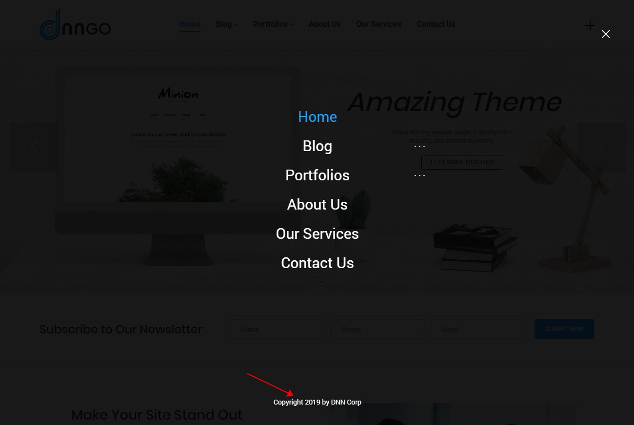
Gives the site a full-screen overlay menu that slides in when the nav icon is clicked.

| Setting | Description |
|---|---|
| Text Box | Extra content below the menu |
| Text Box Typography | Text style of that area |
Overlay Panel
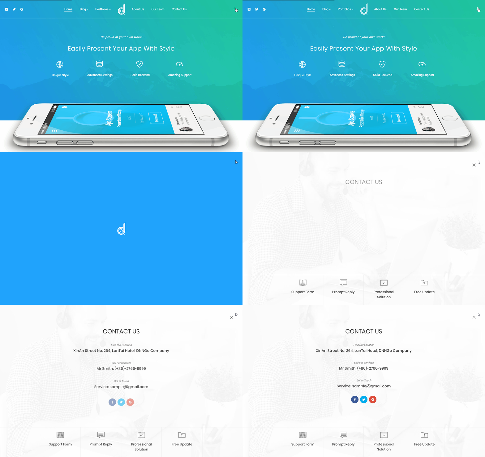
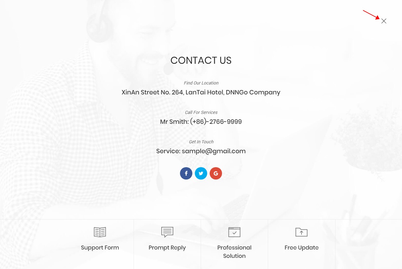
Gives the site an overlay panel that pops up when the nav icon is clicked.
Overlay Panel Settings
| Setting | Description |
|---|---|
| Background Color Gradient Start | Start color of the panel's gradient background |
| Background Color Gradient End | End color of the panel's gradient background |
| Background Opacity | Opacity of the panel background |
| Close Button Color | Color of the close button |
Revealer Settings
The enter animation of the overlay panel.
| Setting | Description |
|---|---|
| Direction | Direction the animation enters from |
| Effect | The animation style — Simple, Duo Move, Triple Swoosh or Content Move |
| Effect Background Color | Background color during the animation |
| Display Logo | Show the logo during the animation |
Nav Icon
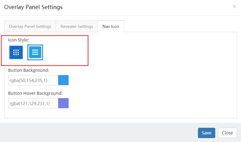
The nav icon of the overlay panel.
| Setting | Description |
|---|---|
| Icon Style | Two icon styles |
| Button Background | Background of the button |
| Button Hover Background | Background of the button on hover |
Side Panel
Gives the site a side panel.
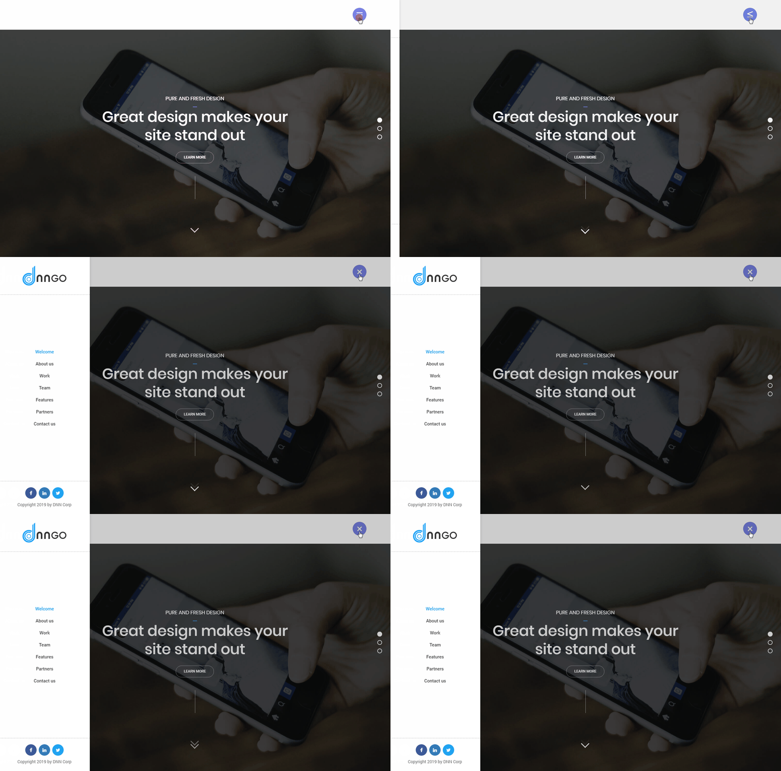
Side Panel Layout
| Setting | Description |
|---|---|
| Panel Layout | Two layouts: one with a side menu, one with panes only |
| Side Panel Effect | Pop-up or permanently fixed |
| Side Panel Width (px) | Width of the panel |
| Typography | Text style inside the panel |
| Display Shadow | Show a shadow on the panel |
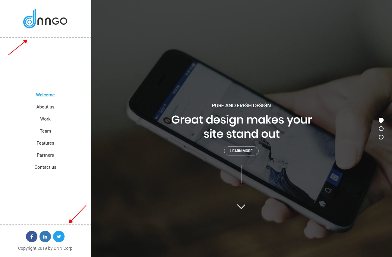
| Display Horizontal Split Line | Divider lines between the controls |
| Setting | Description |
|---|---|
| Bottom Border | Style of the divider |
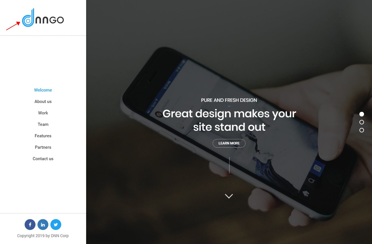
| Display Logo | Show a logo in the panel |
| Setting | Description |
|---|---|
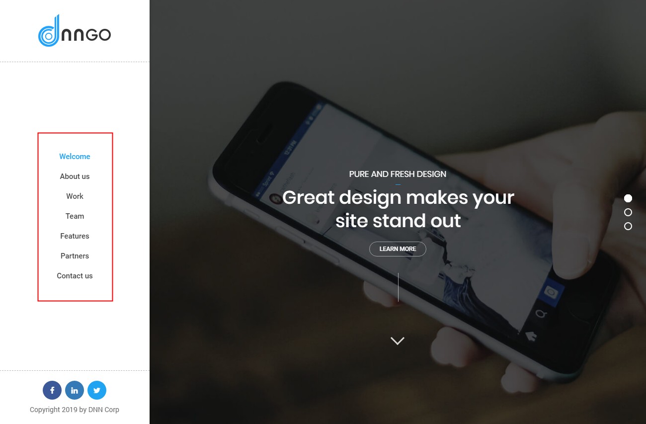
| Display Menu | Show the side menu |
| Setting | Description |
|---|---|
| Menu Typography | Text style of the main menu |
| Sub Menu Typography | Text style of the sub-menus |
Nav Icon
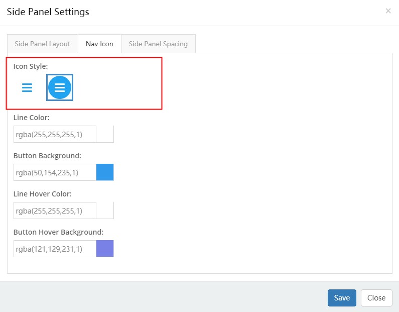
The nav icon of the side panel.
| Setting | Description |
|---|---|
| Icon Style | Two icon styles |
| Line Color | Line color of the icon |
| Button Background | Background of the icon |
| Line Color (Hover) | Line color on hover |
| Button Background (Hover) | Background on hover |
Side Panel Spacing
Spacing between the panes inside the panel.
Mobile Menu
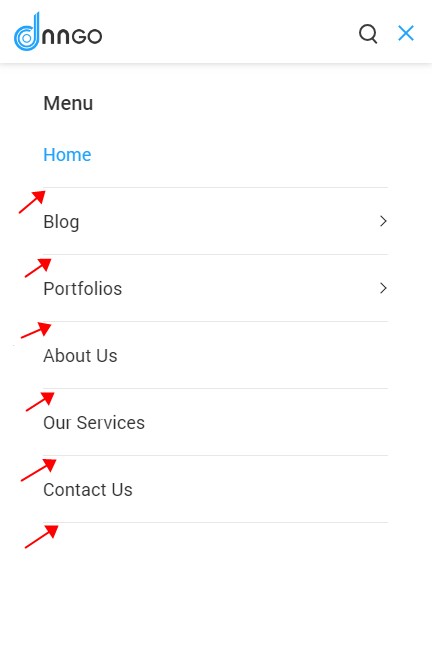
The Mobile Menu control belongs to the mobile header.
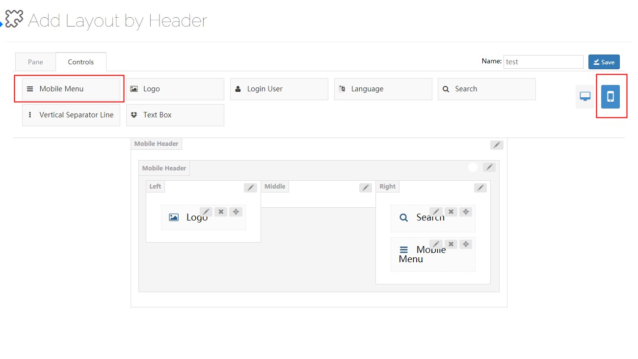
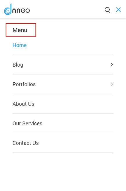
Tapping the nav icon opens the menu.

| Setting | Description |
|---|---|
| Main Menu Typography | Text style of the main menu |
| Sub Menu Typography | Text style of the sub-menus |
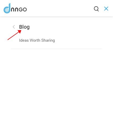
| Menu Title Typography | Text style of the menu title |
| Setting | Description |
|---|---|
| Line Color | Color of the divider lines |
| Setting | Description |
|---|---|
| Navbar Title | Text of the menu title |