RadioButtonList
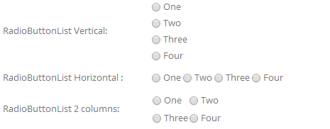
RadioButtonList presents all options as a radio group; users click to select one. Compared with a dropdown, all options are directly visible for faster selection.
Specific Settings
List Collection
One option per line:
Very satisfied
Satisfied
Neutral
Dissatisfied
Direction
- Vertical: options stacked vertically (default).

- Horizontal: options laid out horizontally.

Column
The number of columns to display — valid only when Horizontal is selected. Set 2 or 3 columns for many options to keep the layout compact.
Default Value
The pre-selected option; it must exist in List Collection.
Width
The control width (pixels or percent).
Mandatory Validation
Check Required so an option must be selected before submitting.
Use Cases
- Satisfaction ratings (Very satisfied / Satisfied / Neutral / Dissatisfied)
- Yes/No questions
- A moderate number of options (2–8) that benefit from being directly visible
TIP
With many options (8+) consider DropDownList to save page space.
Next Steps
- CheckBoxList — the multi-select version
- Field Types Overview