TextBox
TextBox is the most common input control, allowing users to enter single-line or multi-line text.
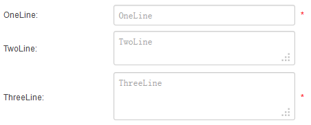
Specific Settings
Width
The input box width, together with its unit (pixels px or percent %). Multiple shorter fields can sit on the same line.
Rows
The input box height in rows. Set to 2 or more for multi-line input.
Verification
Choose a format validation from the dropdown:
| Type | Description |
|---|---|
| optional | Optional; validated only when filled in |
| integer | Integer |
| number | Number |
| date | Date (YYYY/MM/DD, YYYY-MM-DD etc.) |
| Email address | |
| phone | Phone number |
| ipv4 | IPv4 address |
| url | URL starting with http://, https:// or ftp:// |
| onlyNumberSp | Digits and spaces only |
| onlyLetterSp | Letters and apostrophes only |
| onlyLetterNumber | Digits and letters only |
Equals Control
Select another TextBox field; the two inputs must match on submission.
Example
"Confirm email": add a first TextBox named Email (Alias: Your Email), then a second named EmailConfirm (Alias: Confirm Email), and select Email in the second field's Equals Control.
Max Length
The maximum number of input characters.
Default Value
A default value automatically filled in when the form opens.
Mandatory Validation
Check Required to make the field mandatory; combined with Verification you get "required + format" dual validation with localized prompts.
Next Steps
- RichTextBox — rich text input
- Field Types Overview