
Mega Menu
On this settings page you choose the pop-up menu type for a first-level menu item. Three types are available: the standard drop-down, the multi-column Mega Menu, and the Custom Mega Menu that accepts your own content.
Where to find it
This setting applies to first-level pages. In Pages, click Edit Megamenu for the target page.
Standard Menu
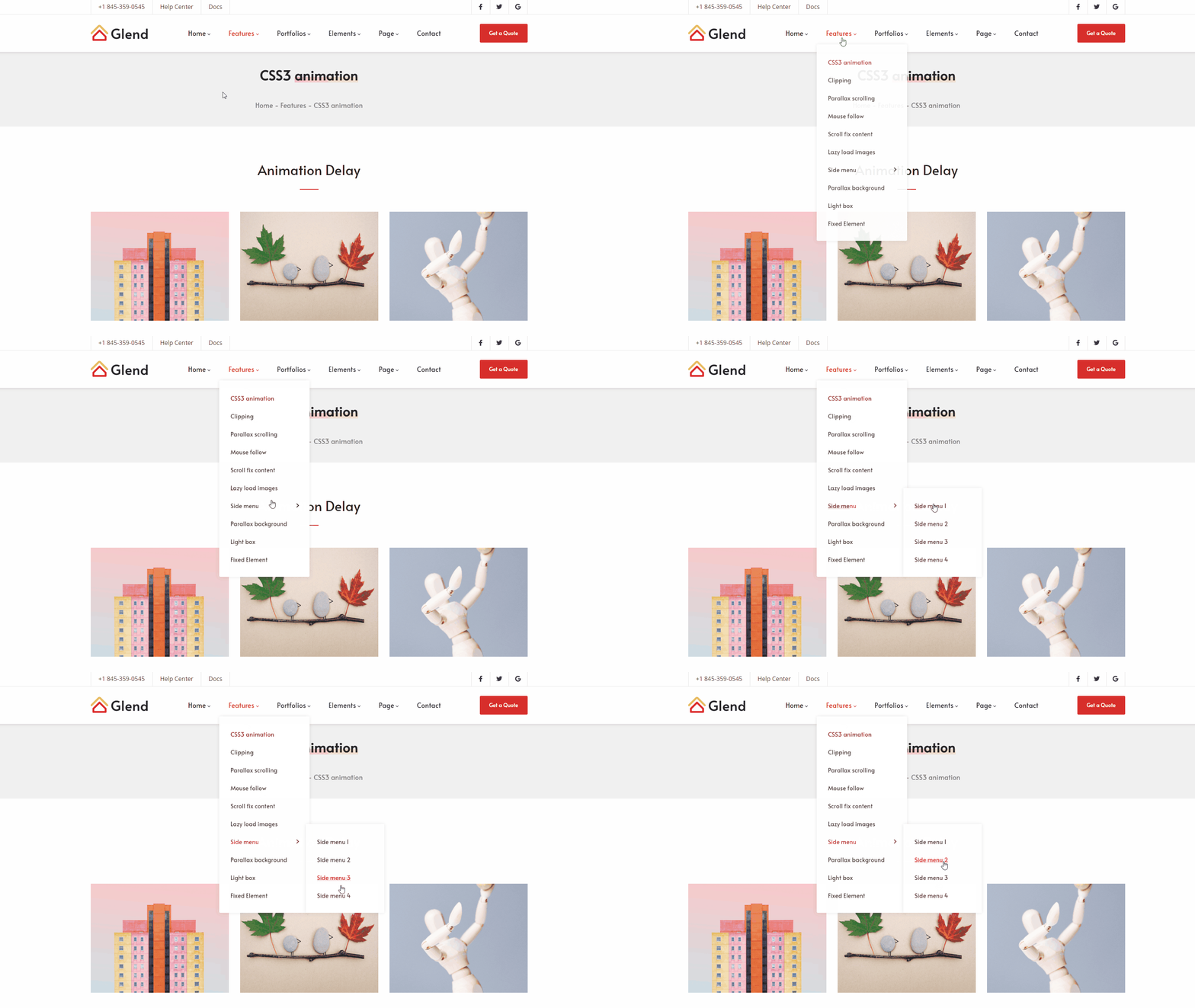
The most common form: hovering over a menu item drops a single-column sub-menu below it.
Mega Menu
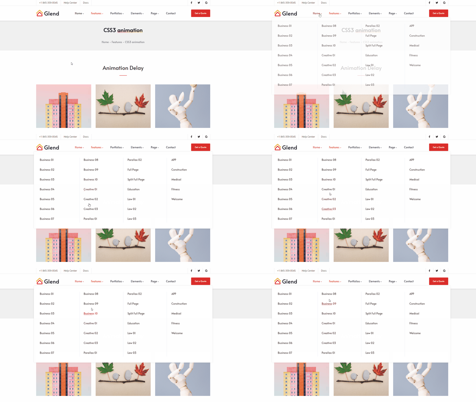
Spreads the sub-menu content across multiple columns — ideal for navigation that presents several groups at once.
| Setting | Description |
|---|---|
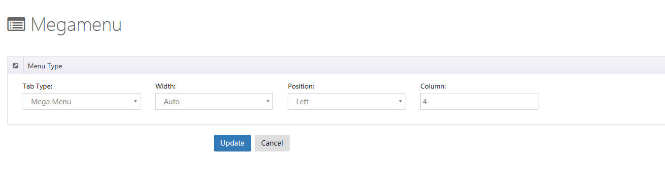
| Width | Width of the sub-menu, in two modes (below) |
| Position | Where the sub-menu appears |
| Column | Number of columns in the sub-menu |
Width has two modes:
- Auto — the sub-menu is as wide as the theme's content area.
- Custom — set the sub-menu to a specific width.
Custom Mega Menu
Builds on the Mega Menu by letting you insert your own content into the drop-down panel — HTML, third-party modules, or modules from other pages. The most flexible option.
| Setting | Description |
|---|---|
| Width | Width of the sub-menu (Auto / Custom, same as Mega Menu) |
| Position | Where the pop-up menu appears |
Panes
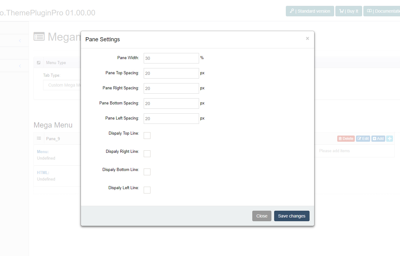
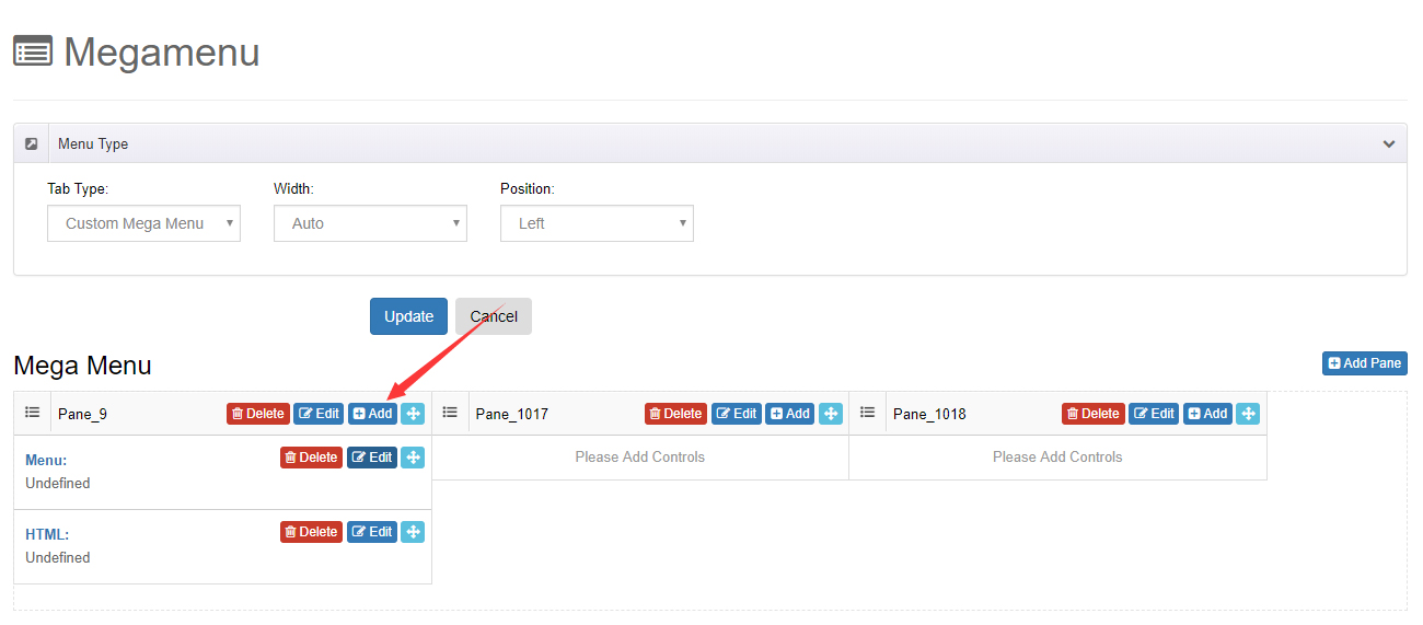
A Custom Mega Menu organizes content in panes. You can add as many panes as you like in the control panel.
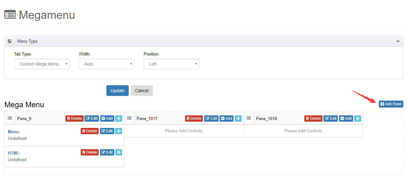
Each pane has its own width, spacing, and border settings.
Controls
Add the following controls to panes to present content:
| Control | Description |
|---|---|
| Menu Control | Displays a chosen menu and its sub-menus |
| HTML Control | Adds custom HTML code |
| Module Control | Calls a module from another page and shows it in the pop-up menu |
Appearance
The visual styling of the expanded mega menu (text, titles, shadows, divider lines) is configured in the header layout — see Header Layouts — Horizontal Menu.