Effect 06 Accordion
Classic accordion panels — click a title to expand its content, with a default open item, fade-in content and fully configurable title/content colors. Ideal for announcements, service items and collapsible content.
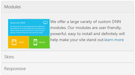
Live Demo
Visit the official demo page to see it in action.
Data Fields
| Field | Description |
|---|---|
| Title | Panel title row |
| Description | Body shown when expanded (rich text) |
| Featured Image | Optional image |
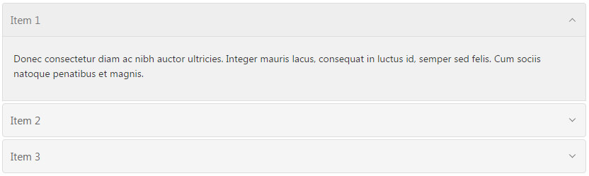
Item form (Field Manager) screenshot:
Effect Settings
Basic
| Parameter | Description |
|---|---|
| Interval | Expand/collapse duration in ms (default 200) |
| Default Open Index | Panel open by default (default 1) |
| Fade Content | Fade the content in |
| Open | Allow multiple panels open at once |
Style Settings
| Parameter | Description |
|---|---|
| Border Color / Title Border Color | Outer border / title divider color |
| Title background Color / Title Color | Title background and text color |
| Content background Color / Content Color | Content background and text color |
| Title Accent series | Highlighted (active) title background, text and border colors |
Related
- Effect Options — configure this effect's theme and parameters
- Effect Overview — all effects
- Adding Items — add items for this effect
- All Items — manage items