Effect 21 Socialsider
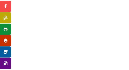
A social icon bar fixed to the page edge — each item is an icon that expands on hover, with configurable size, radius, spacing and a "half-hidden" mode. Ideal for site-wide social links.
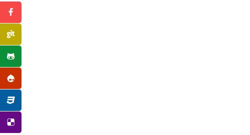
Live Demo
Visit the official demo page to see it in action.
Data Fields
| Field | Description |
|---|---|
| Title | Text revealed on hover |
| Icon | Font Awesome icon (icon picker) |
| Link | Social profile URL |
Item form (Field Manager) screenshot:
Effect Settings
Position & appearance
| Parameter | Description |
|---|---|
| Position | Docking position (Left Top / Left Bottom / Right Top / Right Bottom) |
| Attachment | Positioning (Fixed / Absolute) |
| Icon Size / Font Size | Icon block size (default 42) / icon font size (default 20) |
| Icon Font Color | Icon color (default #FFFFFF) |
| Icon spacing / Edge radius | Icon spacing (default 1) / corner radius (default 0) |
| Hidden spacing | Hover reveal distance (default 10) |
Interaction
| Parameter | Description |
|---|---|
| Opacity on non-hover | Semi-transparent when not hovered |
| Half - hidden | Half hidden outside the screen edge |
| Shadow | Show shadow |
Related
- Effect Options — configure this effect's theme and parameters
- Effect Overview — all effects
- Adding Items — add items for this effect
- All Items — manage items